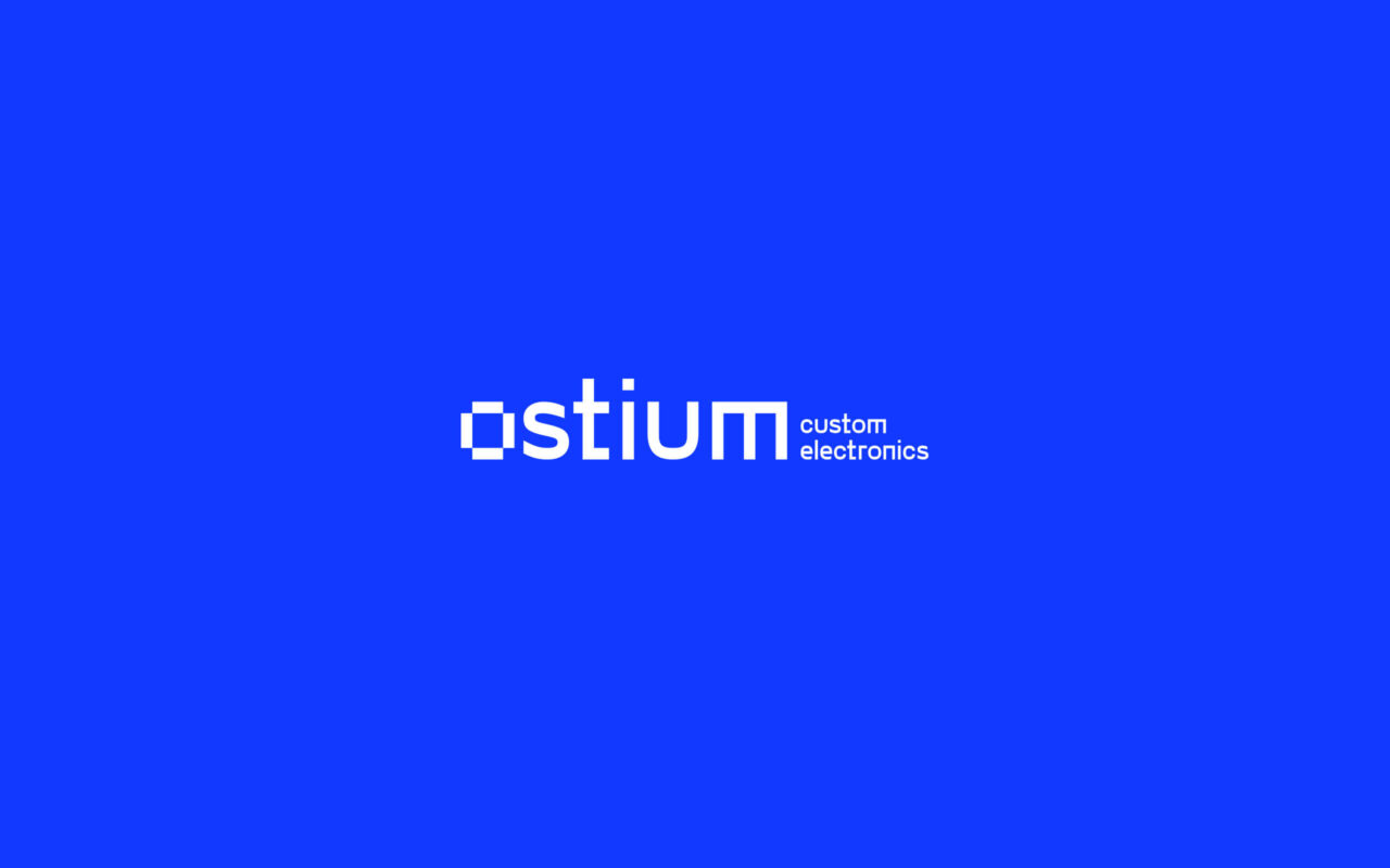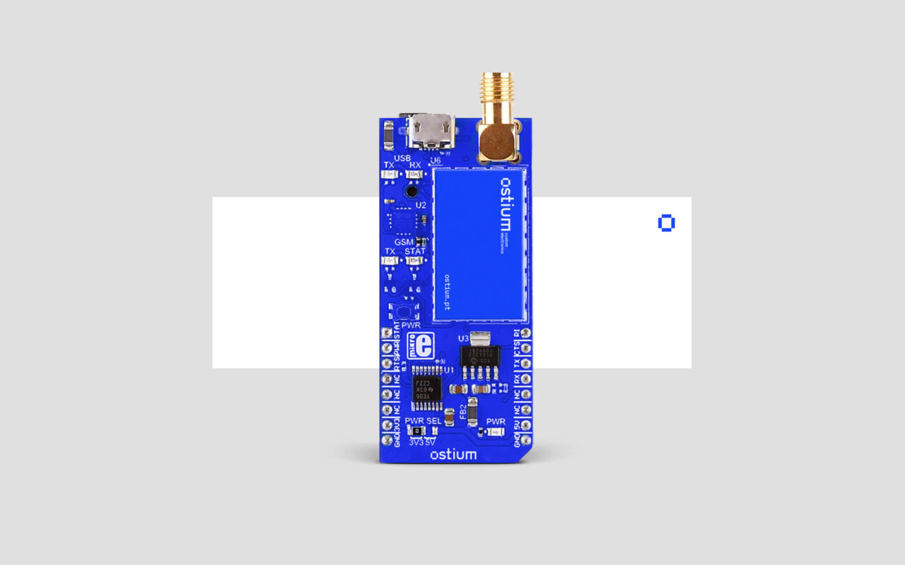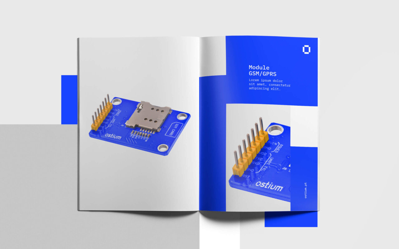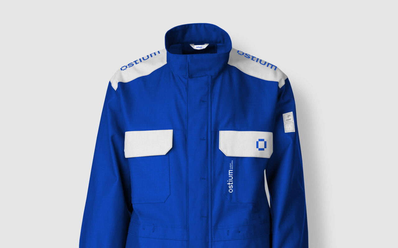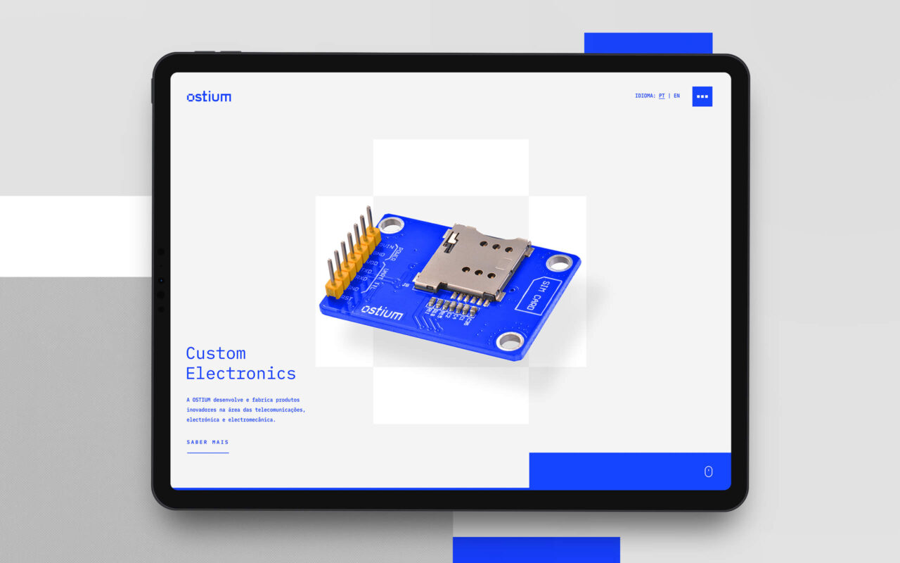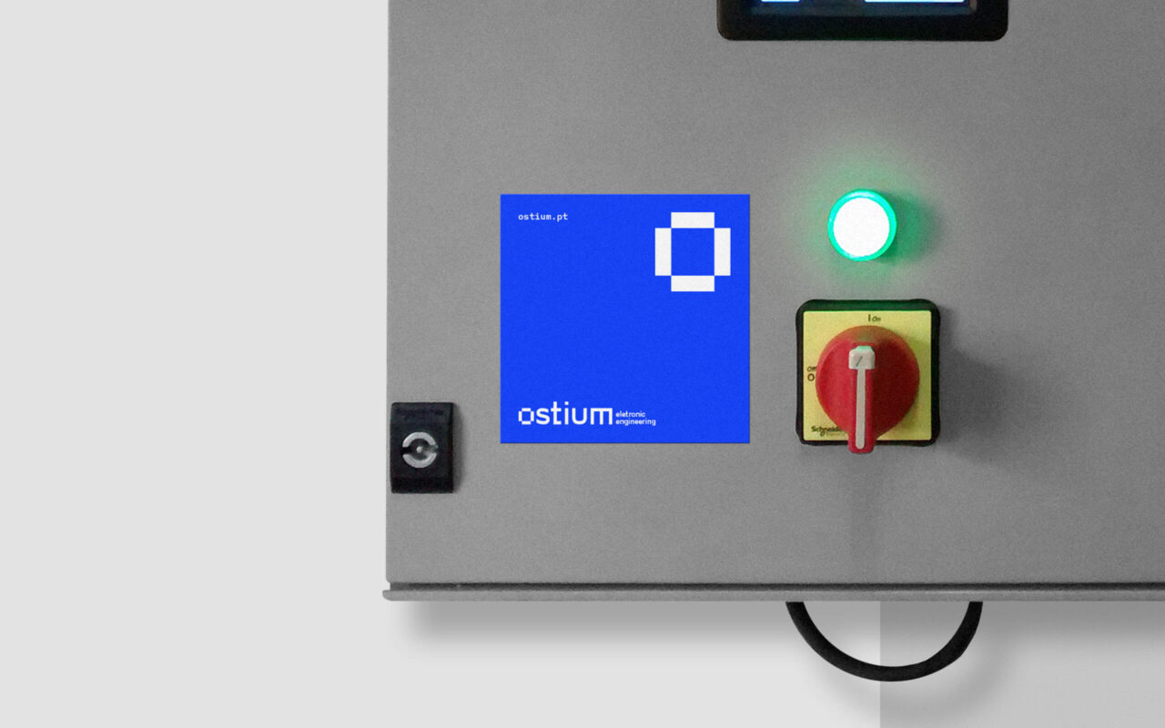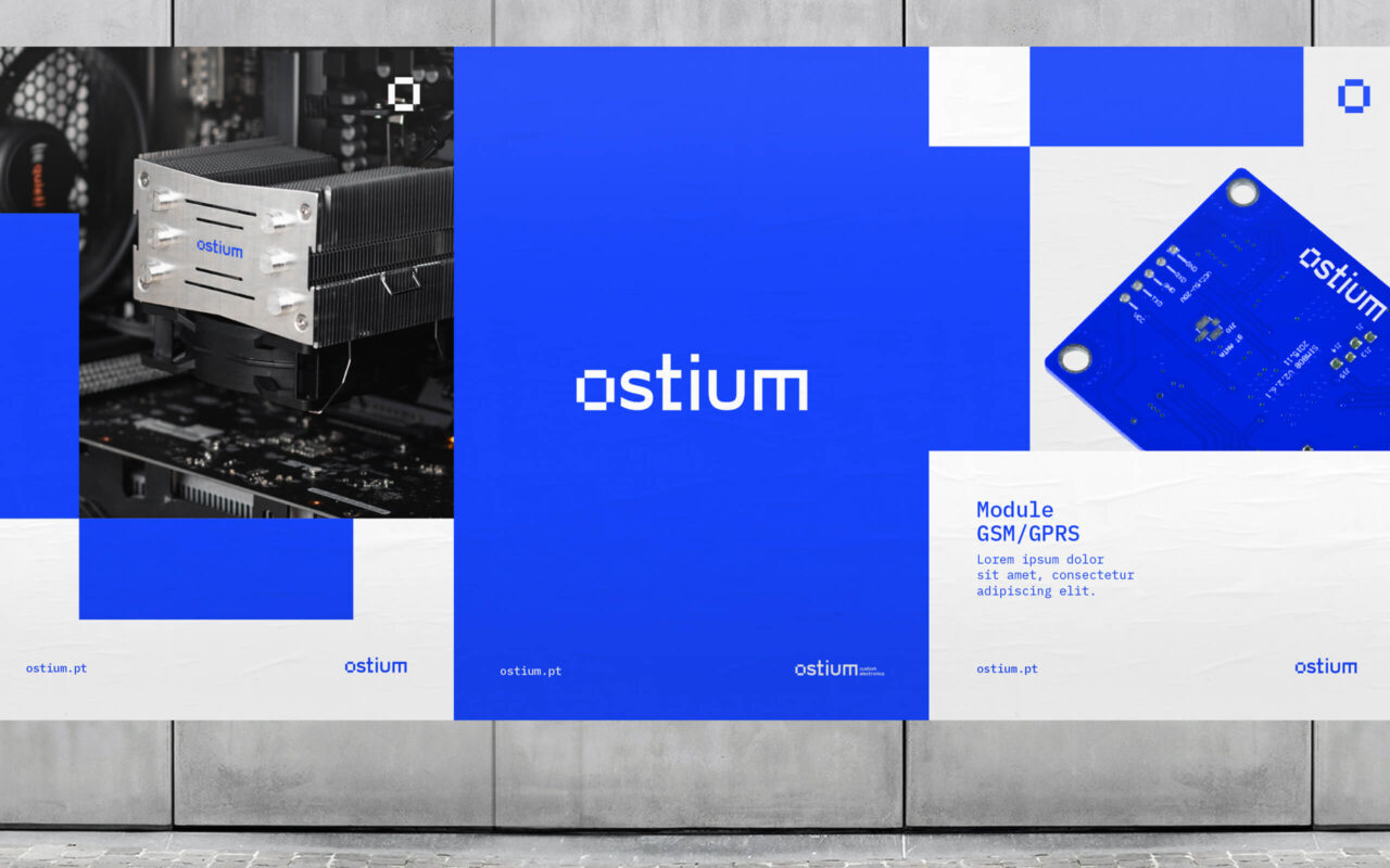
Ostium is a rebranding project for the portuguese company of engineering solutions.
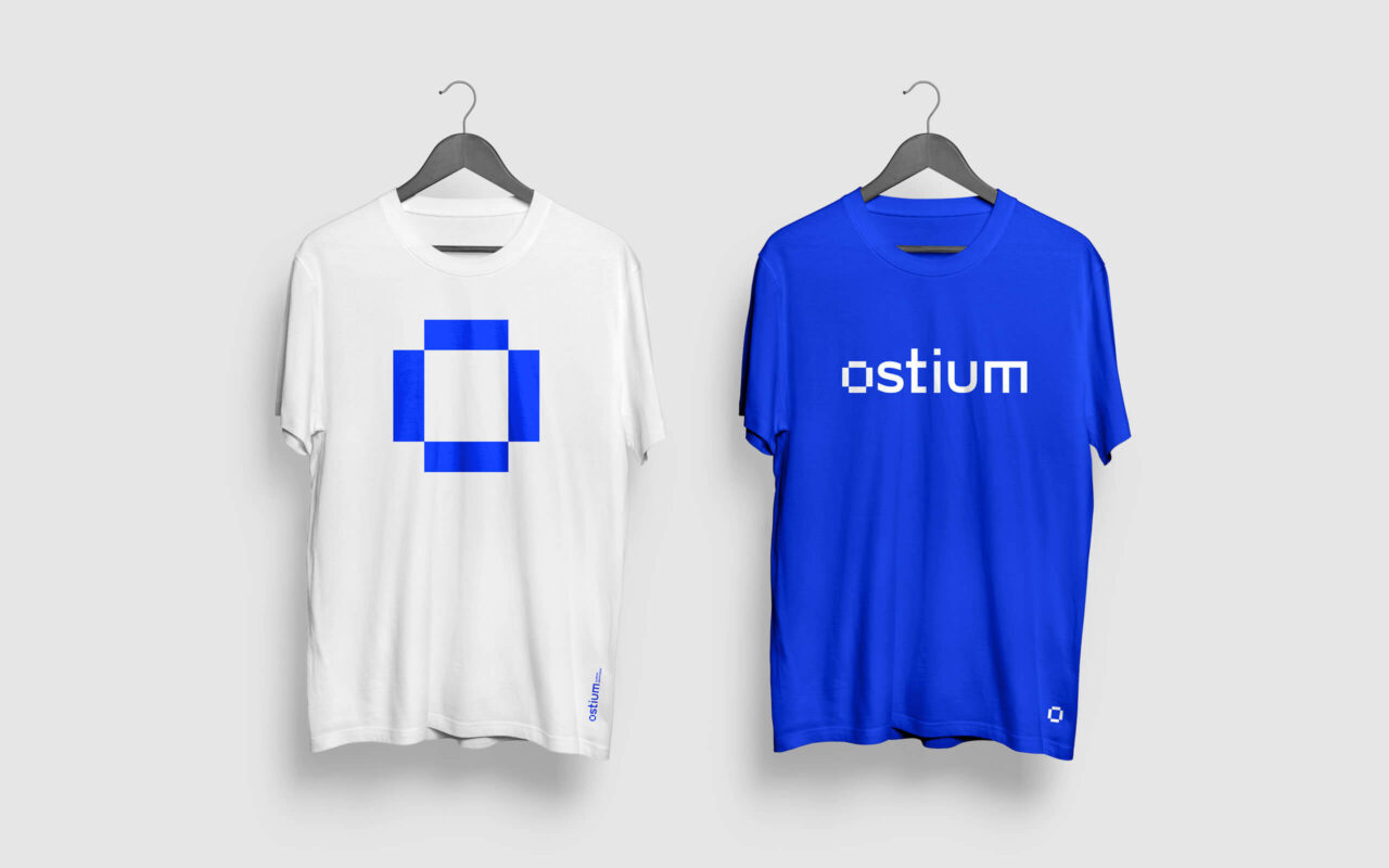
The name “Ostium” has several meanings in Latim, such as “opening, passage, door, portal.”
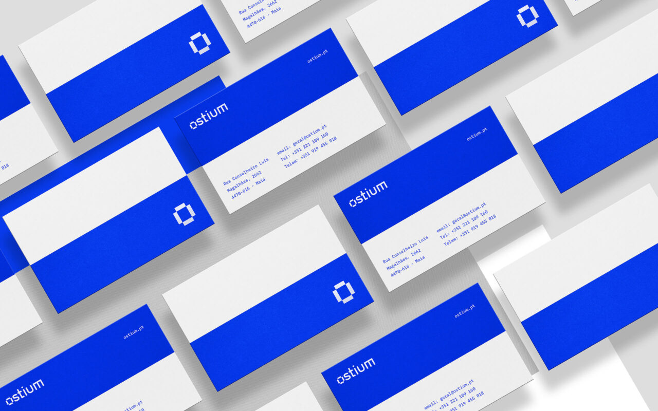
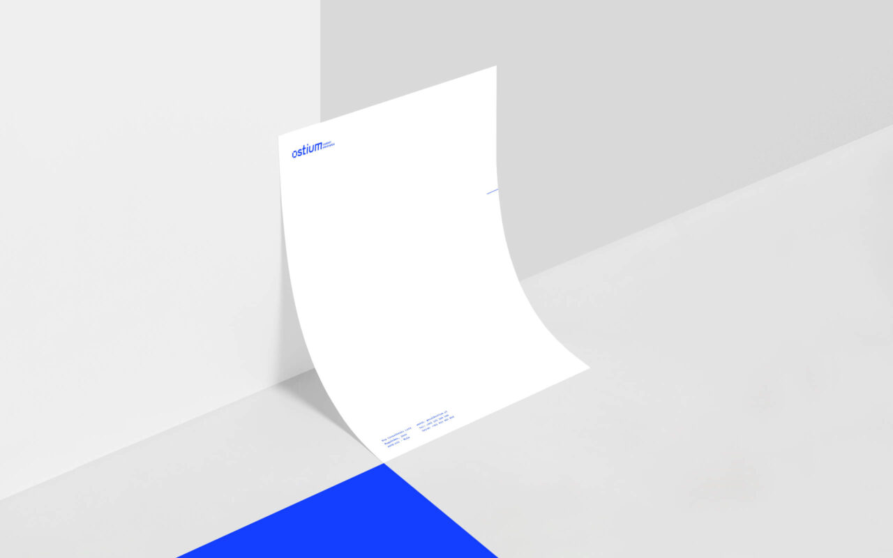
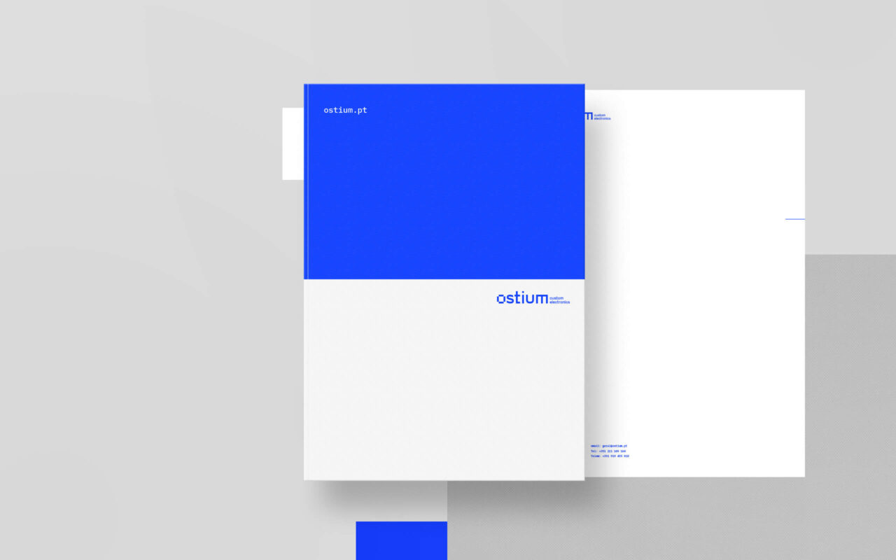
With that aim in mind, we want to incorporate this symbolism on our logo. We have created a custom design on the first vogal “O”, styling a dynamic path, such as a portal to come inside a new dimension.
To this unique design we allied a sans serif custom typography will give a solid and strong identity to the logo.
The colours came from the previous logo in order to preserve all the history of the company. With a smart refinement on the vibrance of the values, we took the blue to a new modern one.