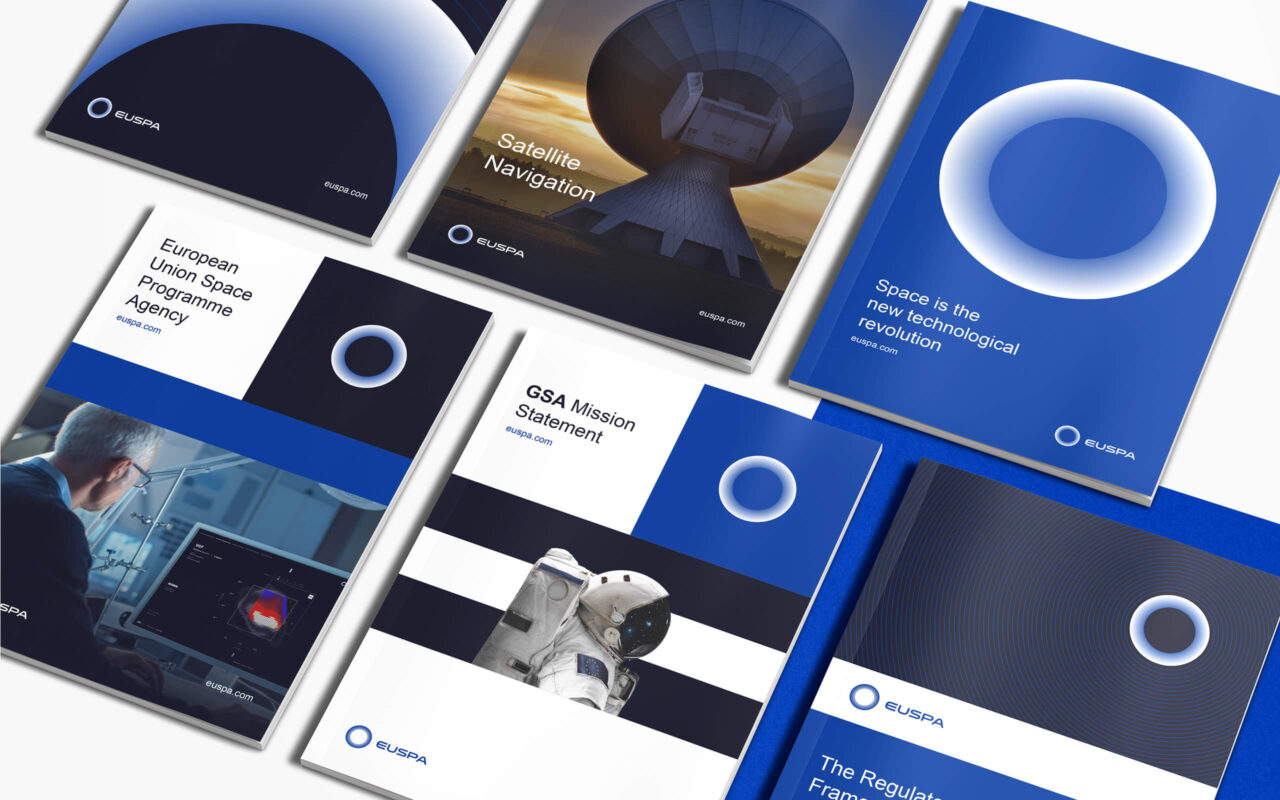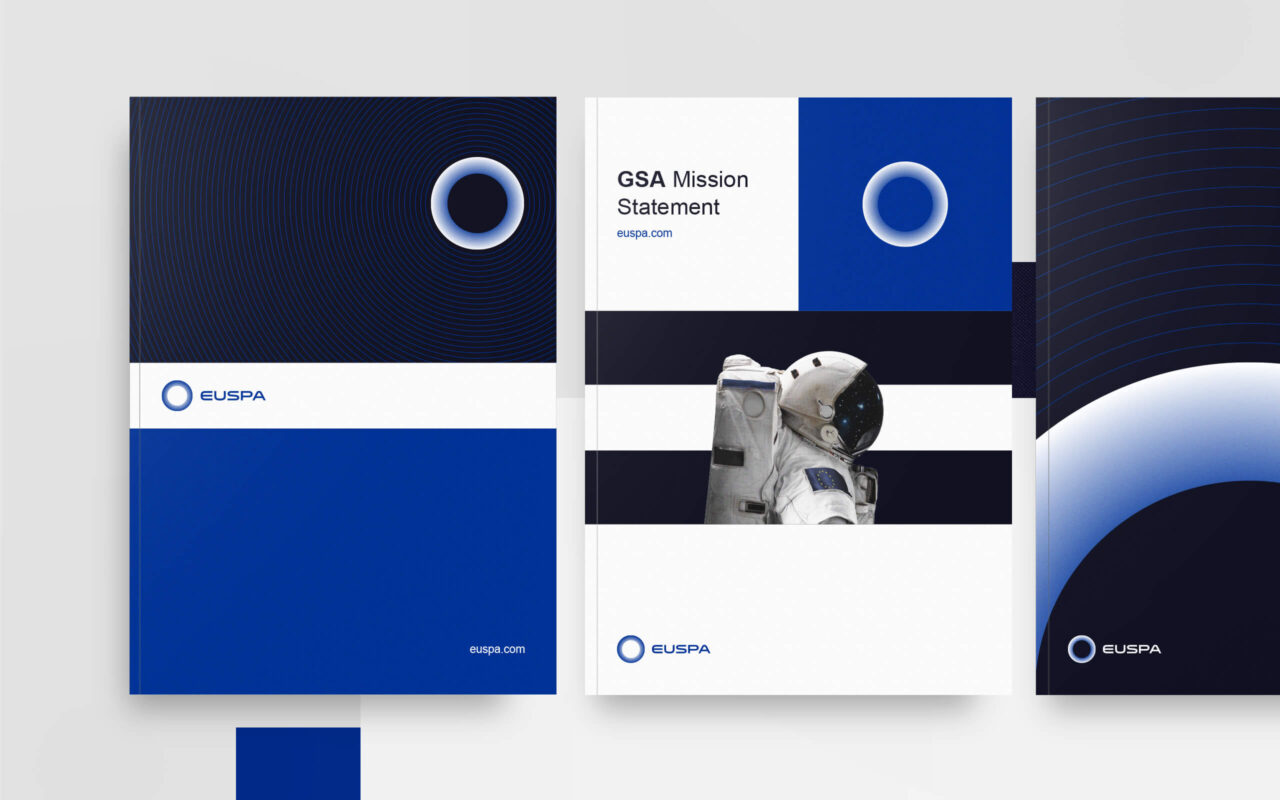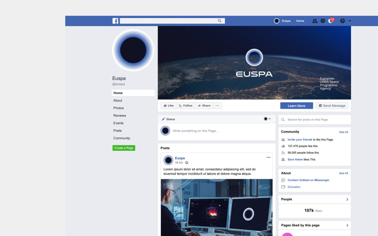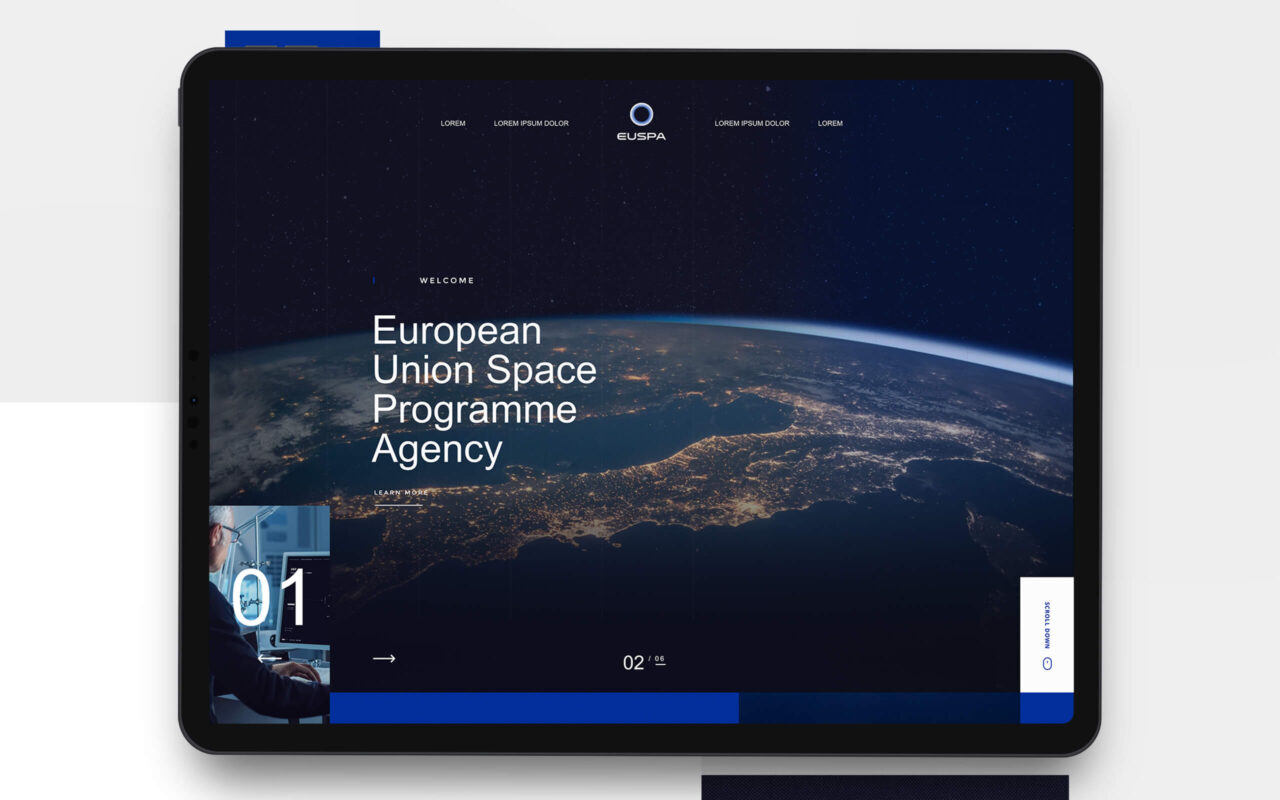
This is our proposal for the new logo for the European Union Agency for the Space Programme (EUSPA).
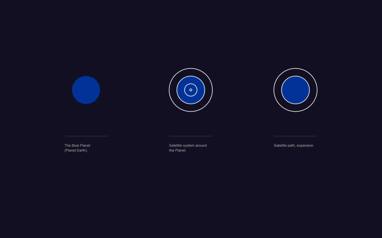
A satellite takes an adventure through the orbit that he perform around the Earth.
The idea immediately hit our concept and we wanted in the exact moment to include that in our logo.
Behind this space themed is also important to emphasize the movement and exploration feeling. In addition to that, we included a touch of innovation and trust, giving the consumers the opportunity to get involve in another dimension with an image of a energic circle that take us apart inside it.
Undoubtedly, these points will be linked together and coexist rather as essential elements.
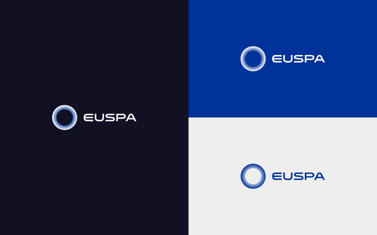
We wanted to develop a cutting edge and memorable logo, but unlike any tedious space logos out there. We have chosen a minimalistic style for the logo and we picked space as addition to the mainly idea.
The choice of typography also plays an important role in all communication, and for this point we chose “Venera”. A font with minimal and futuristic shapes, which makes communication more versatile and with a unique tone of voice.