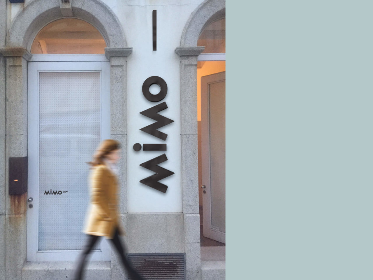
Kids fashion branding project for MIMO Kids Concept Store brand. A space of new trends in a world full of trammels, play and passion for children’s fashion.
The new concept store has an identity that conveys all the purity and energy concentrated in the newest.
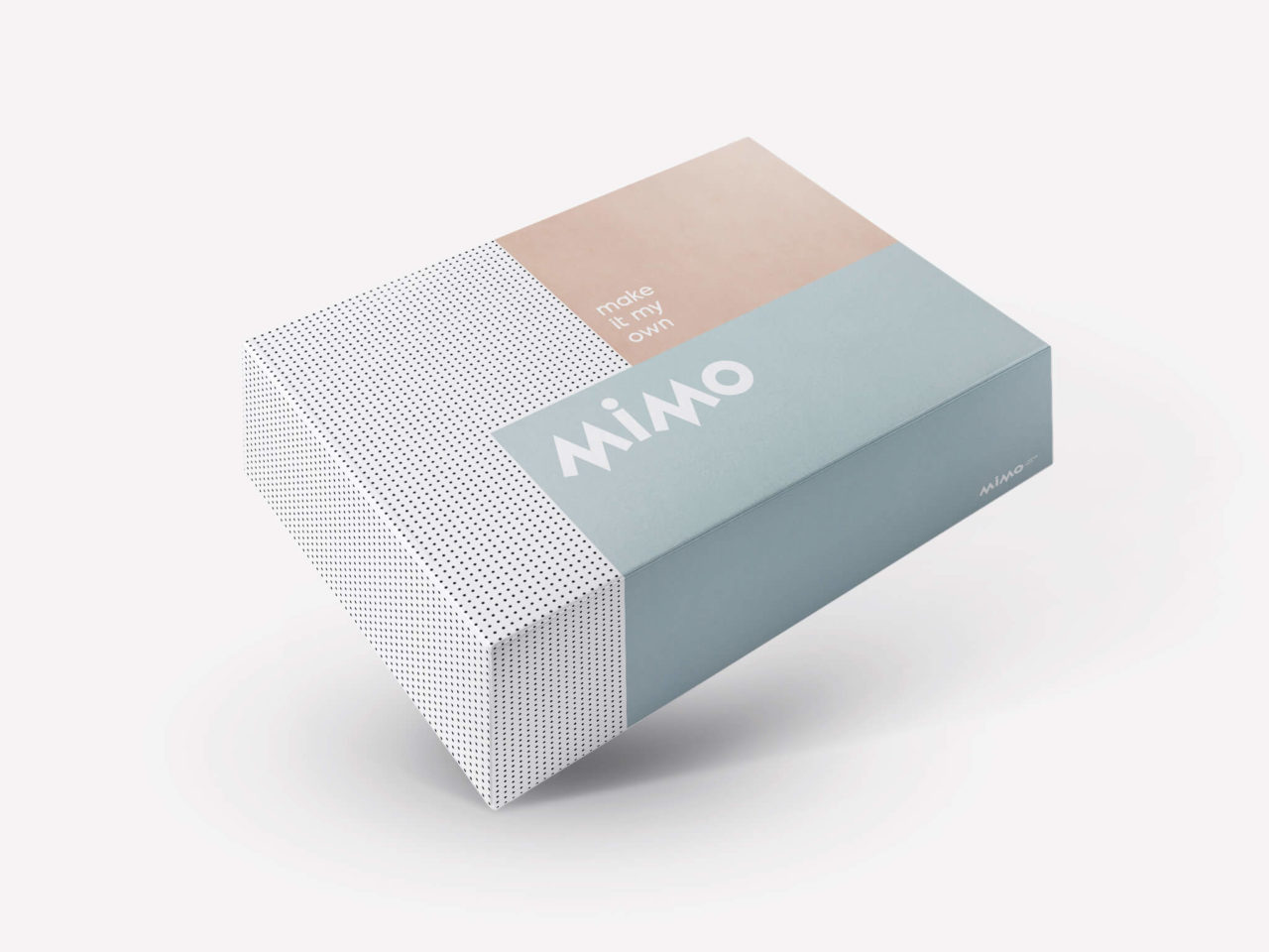
Our aim for this branding was conceiving a subtle image, with a color scheme that evokes the kids purity and playtime moments.
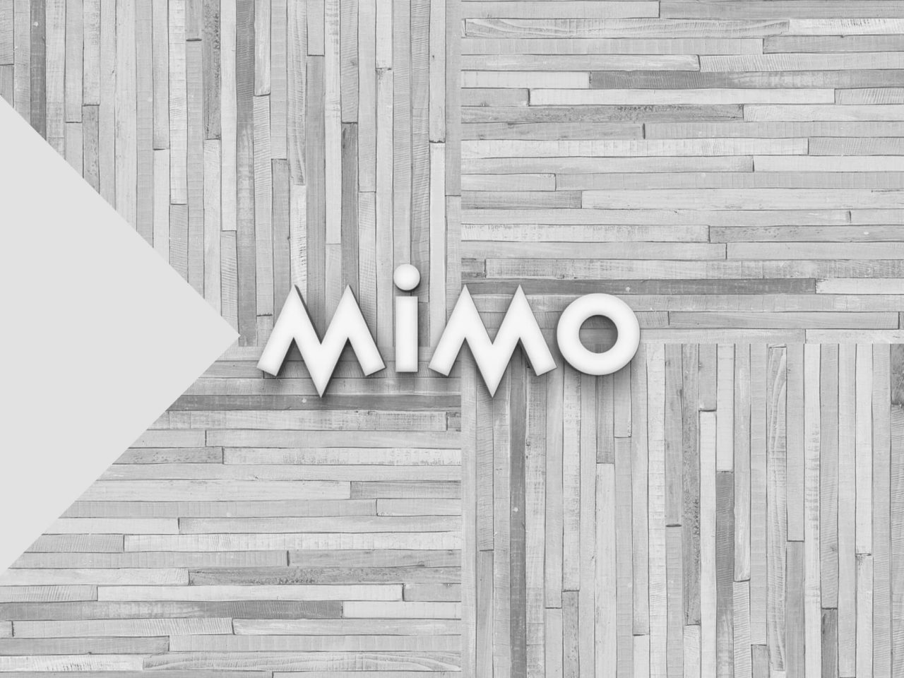
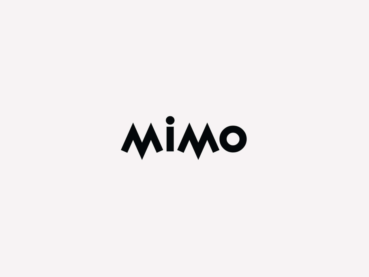
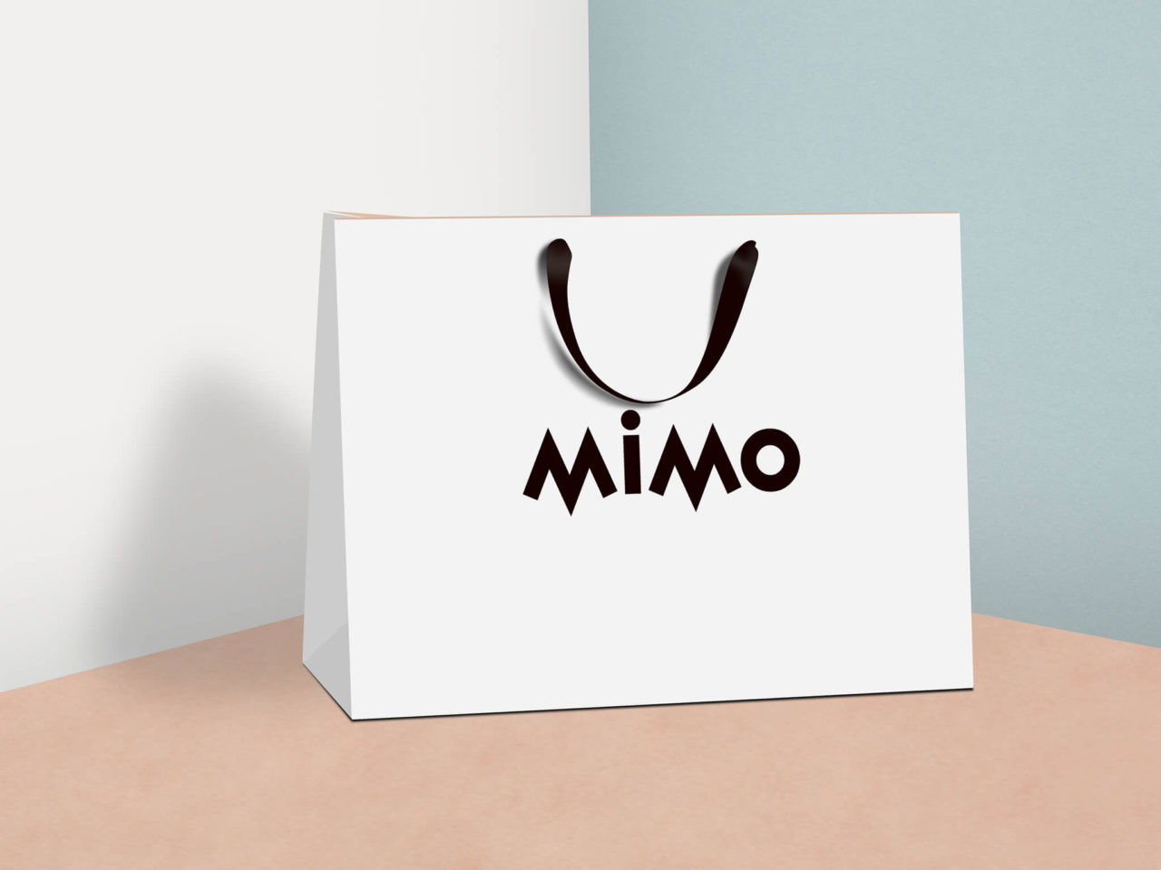
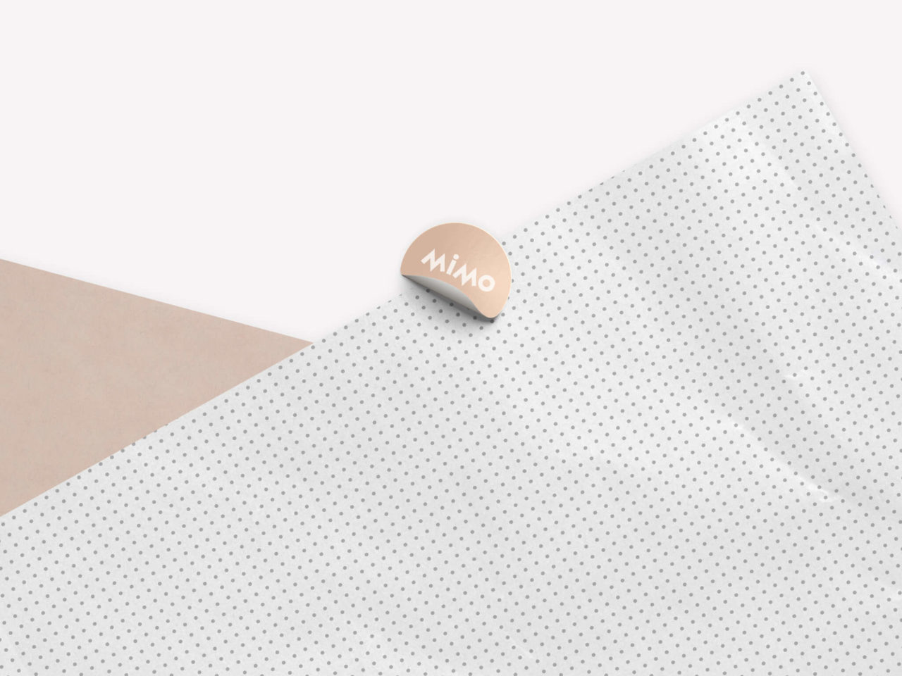
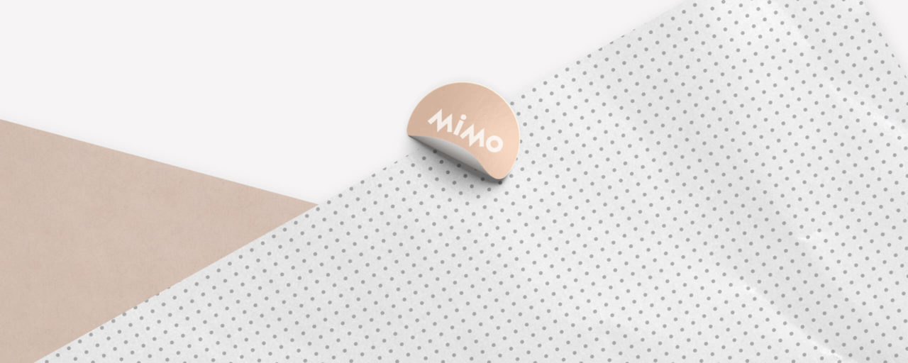
It’s logo is a reflection of the brands communication. We wanted to transmit to MIMO Kids Concept Store,
a bold typography that recreates the children fun energetic side with clean colours.
This is an important blend into communicating the brands target, with trustworthy quality products.
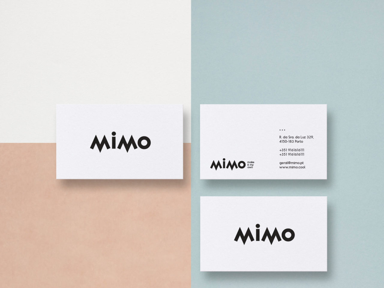
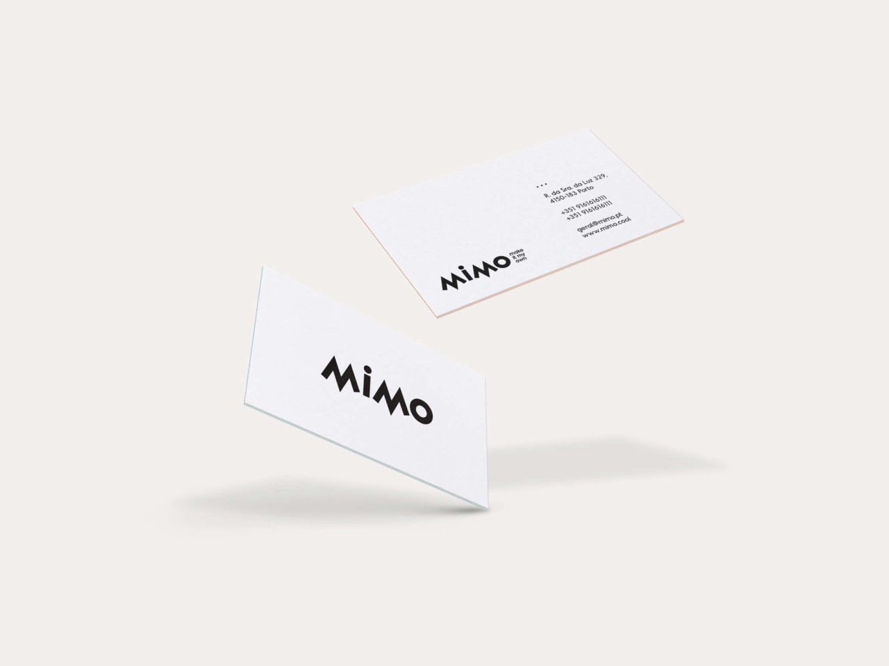
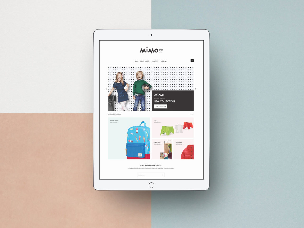
In this project kids fashion branding, we’ve used graphic elements that represent the playfulness of children, with a contemporary look. Also, we’ve designed a packaging design concept and the brand’s website with Mimo’s Kids Concept Store identity. Symbolising the adventurous children side in pursuing their dreams.
A clear brand identity, which is also Bullseye trademark in every project we develop. Bringing a clear and effective message to every created brand. And to communicate the children purity with stylish clothing like grown ups, we’ve created a combination between style and adventure.
See more of our branding design projects.