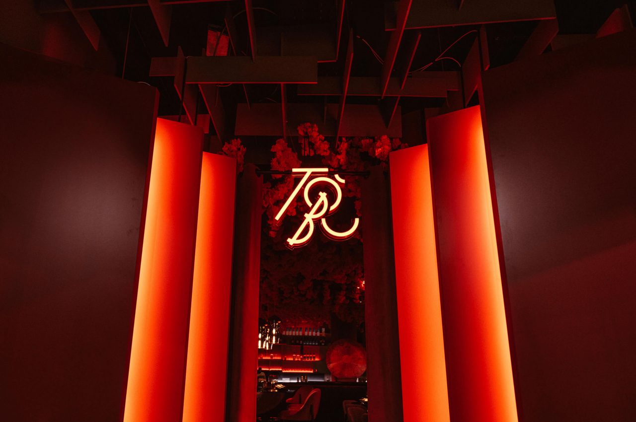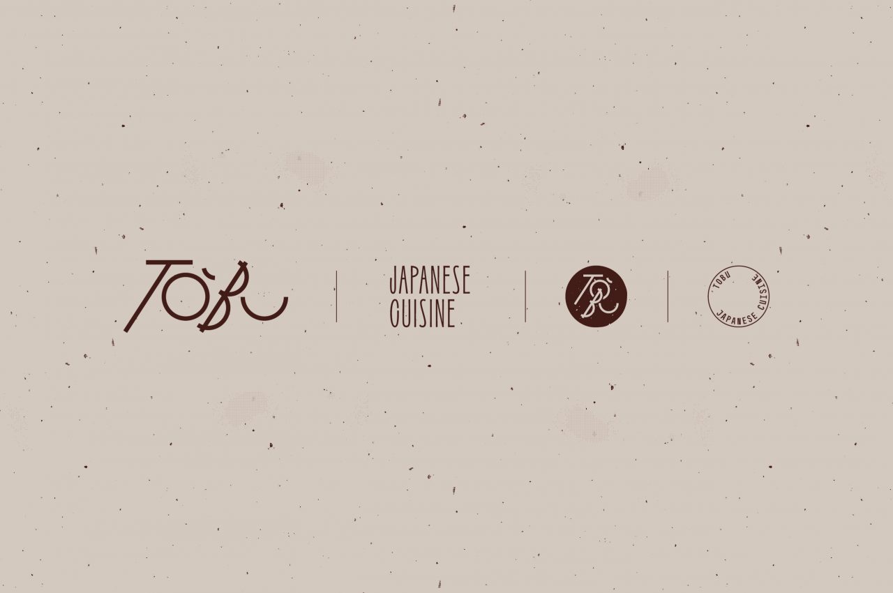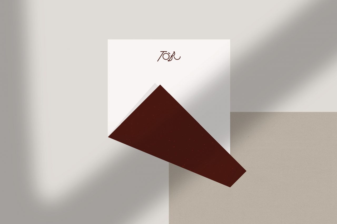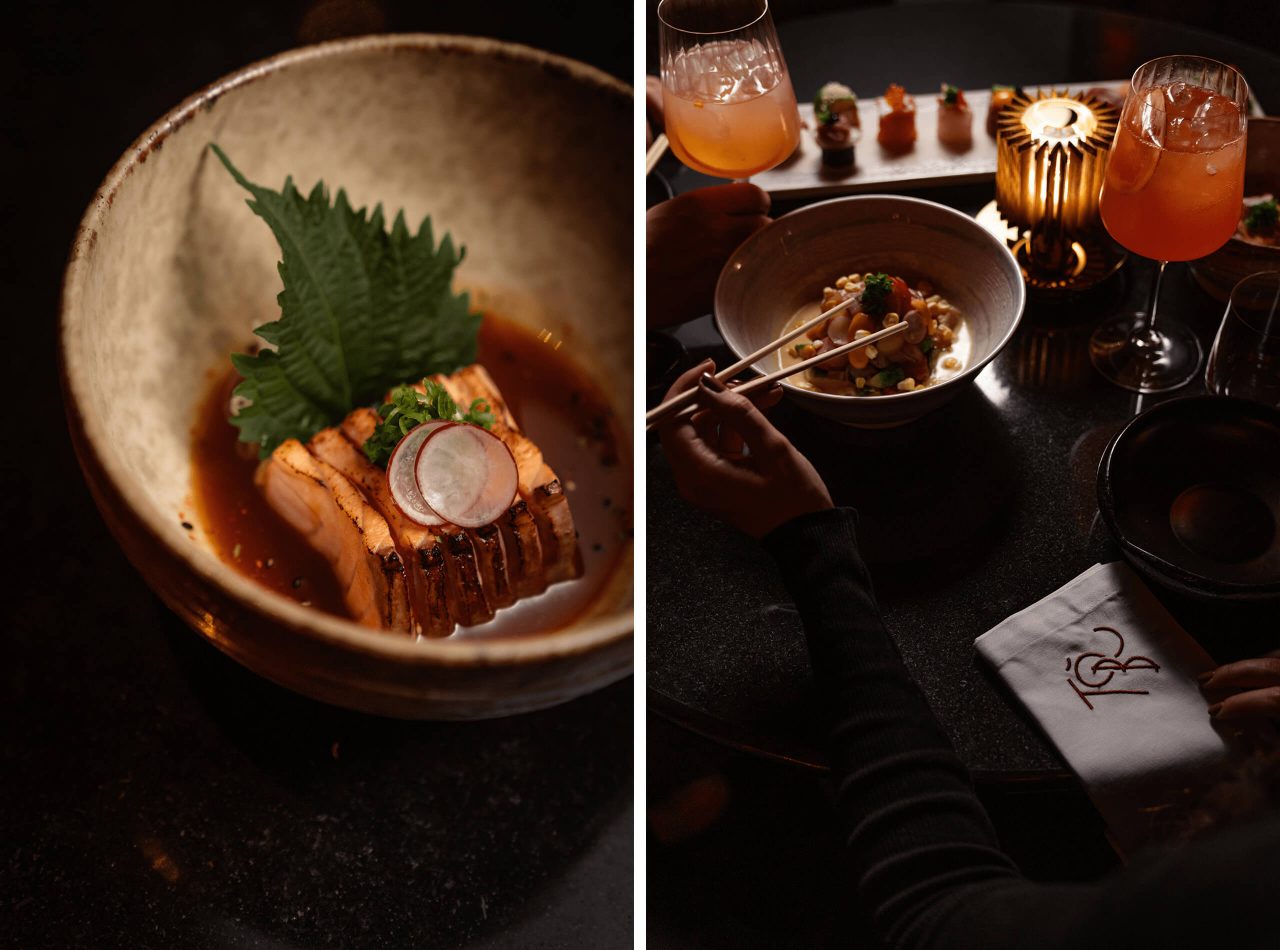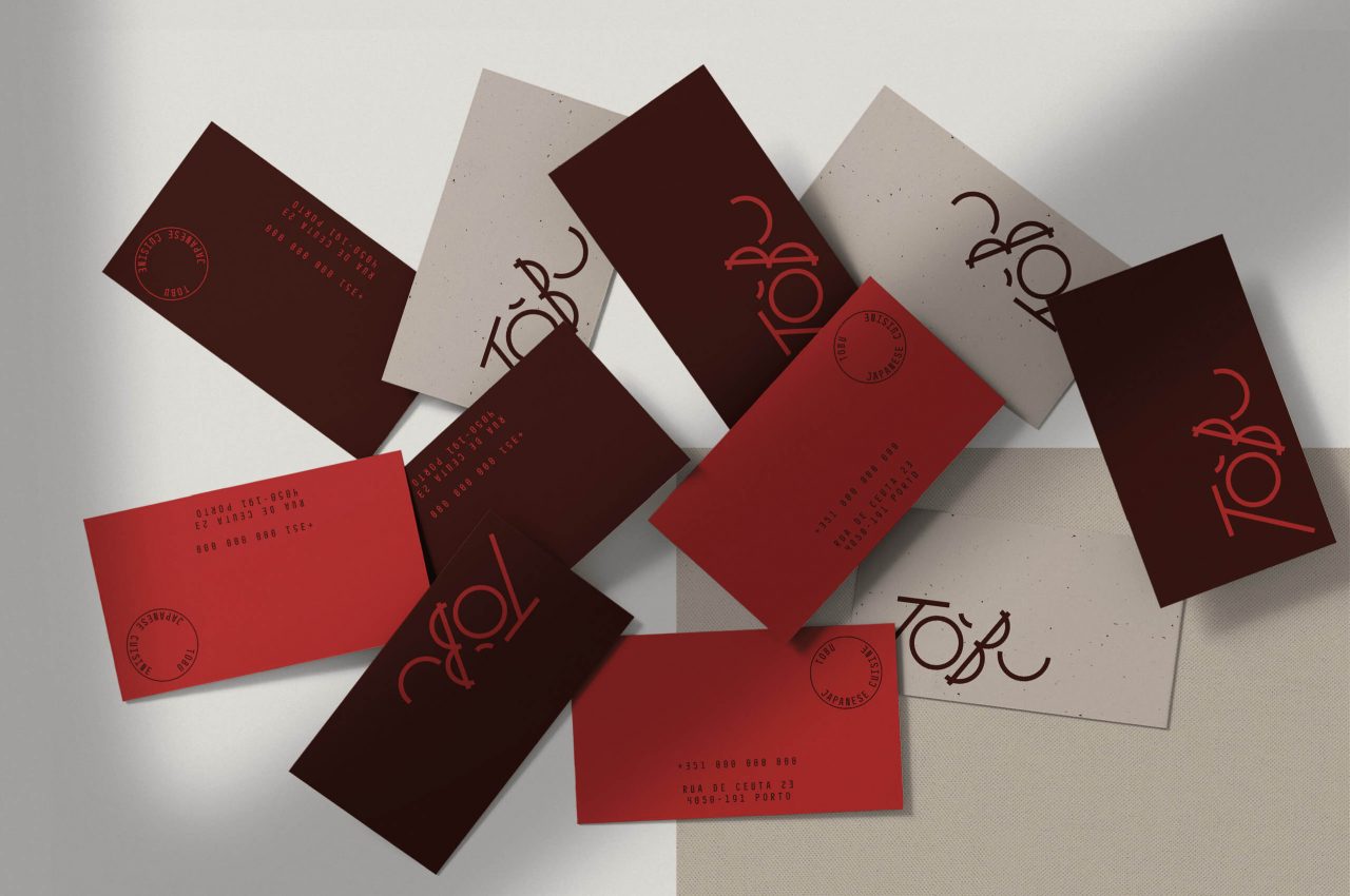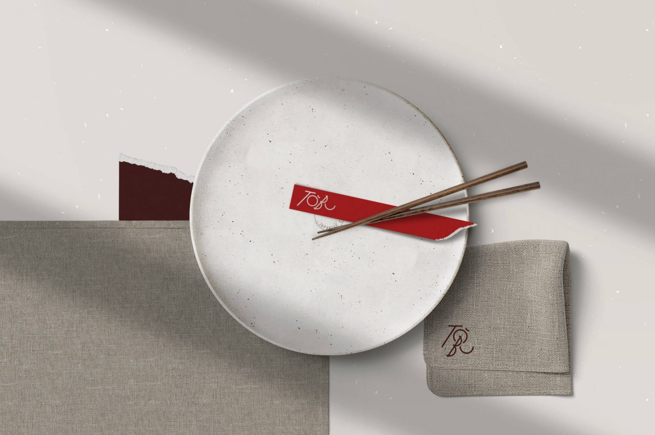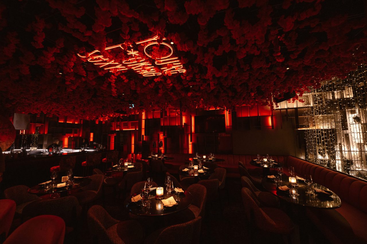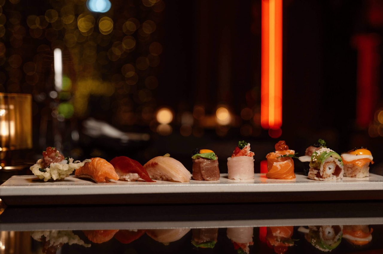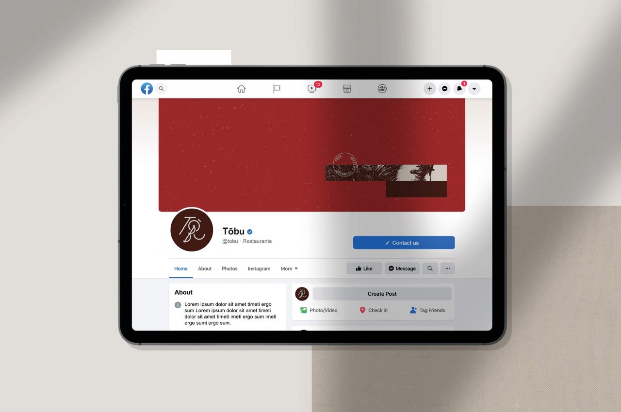
Tōbu is a Japanese cuisine restaurant.
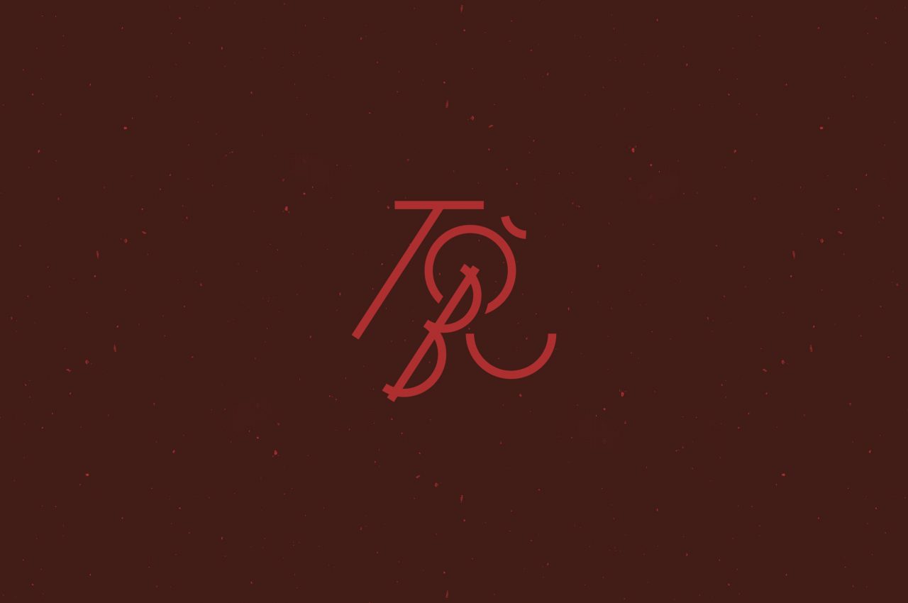
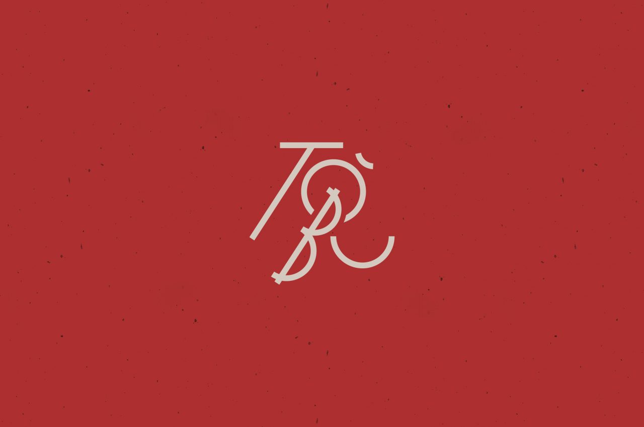
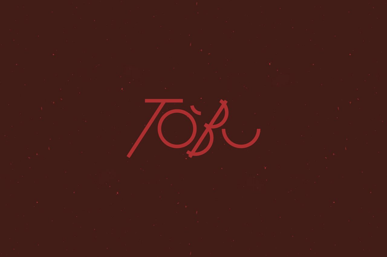
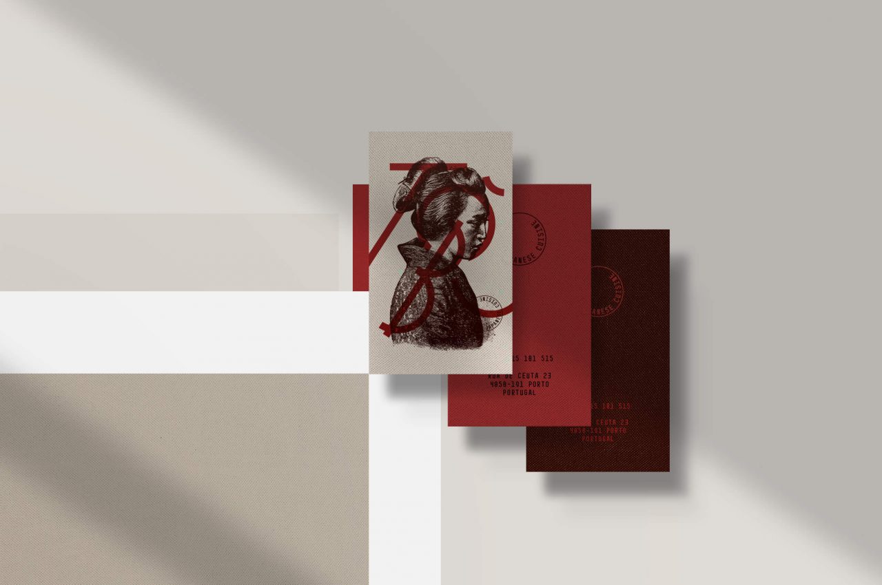
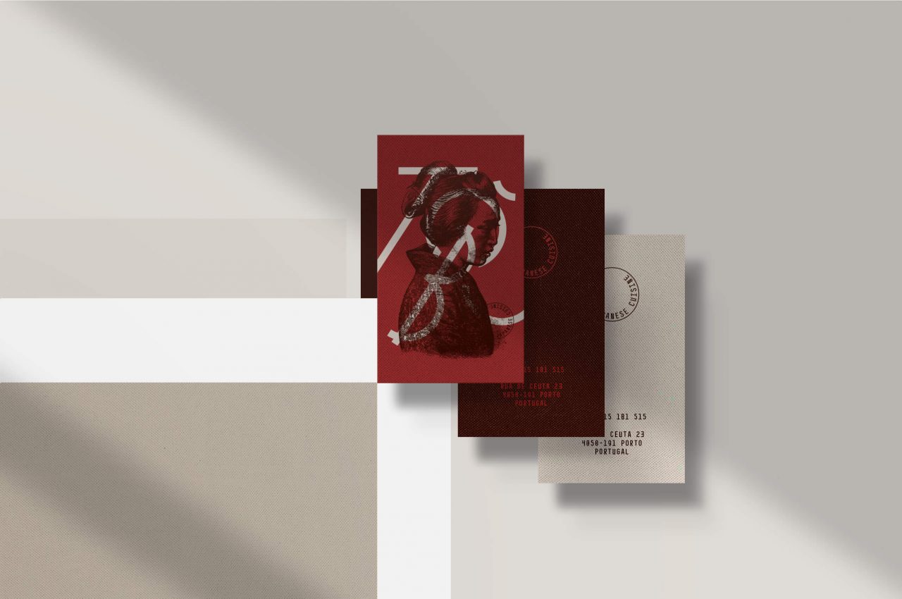
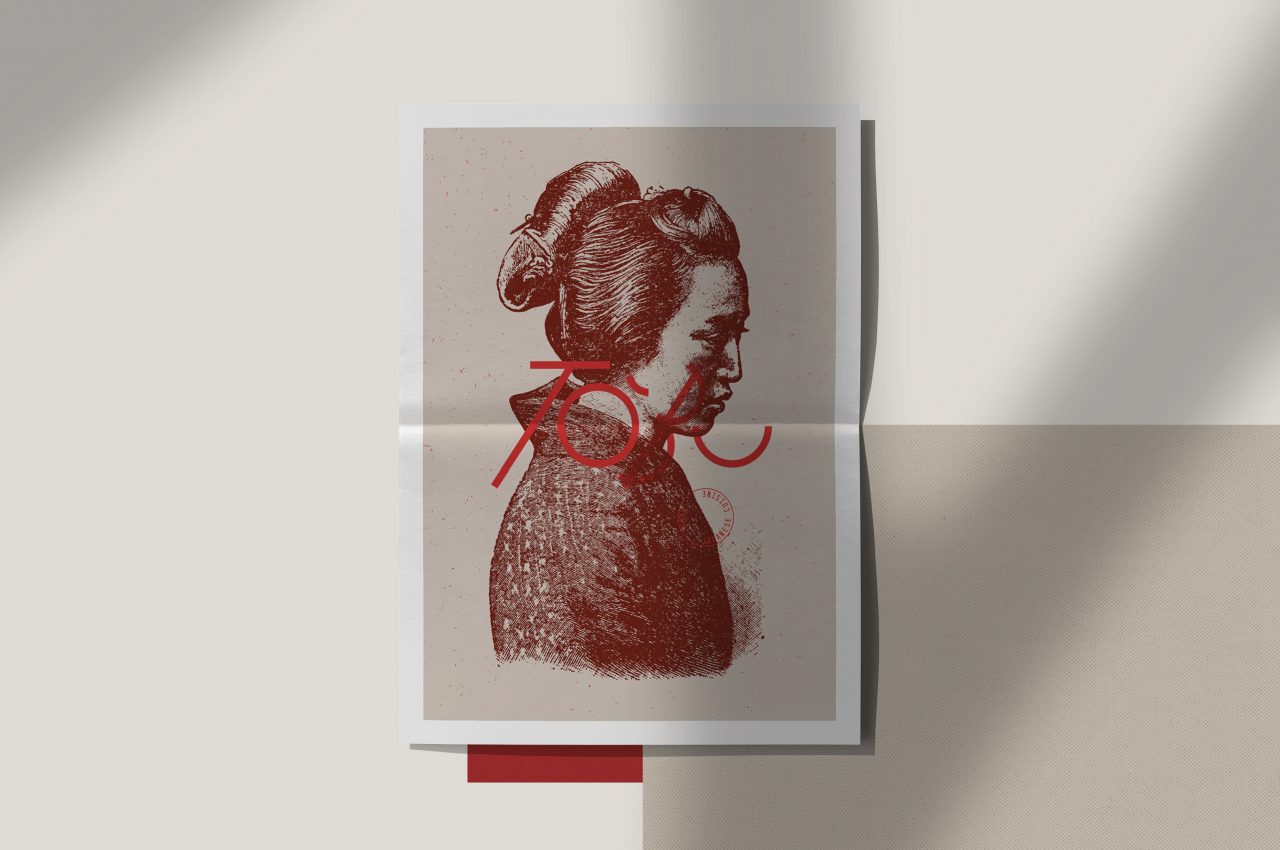
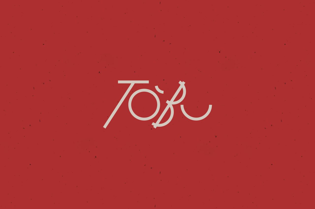
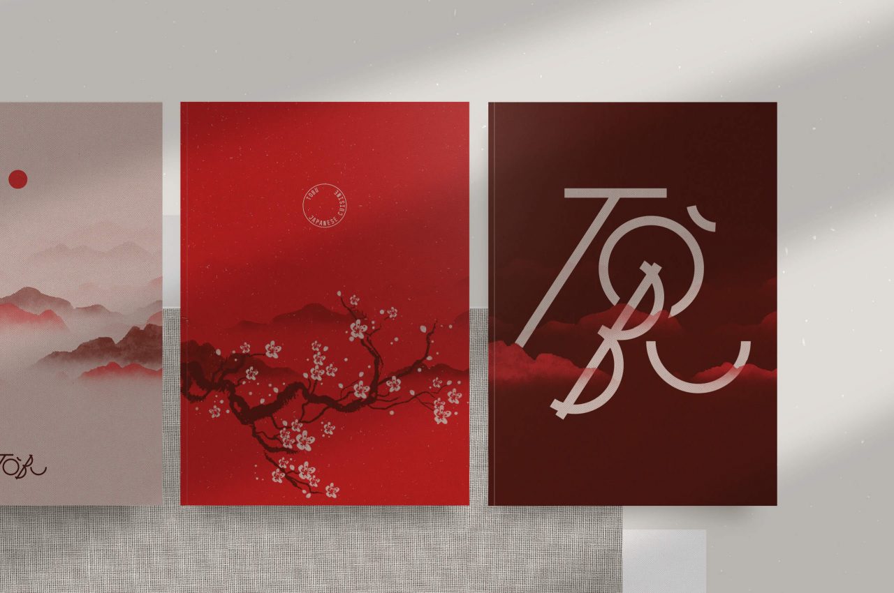
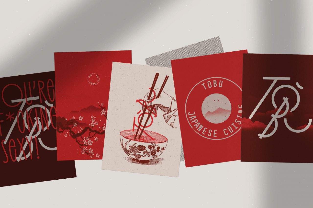
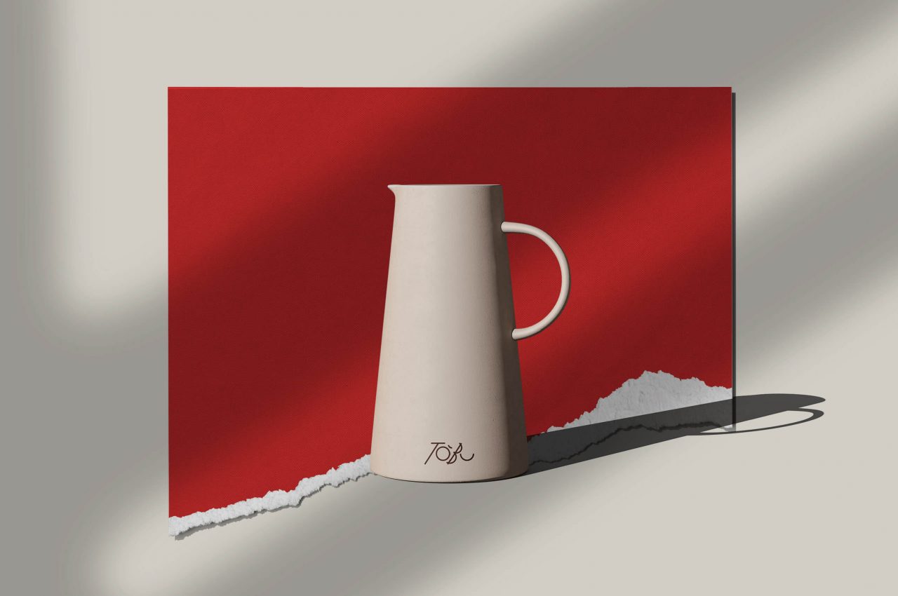
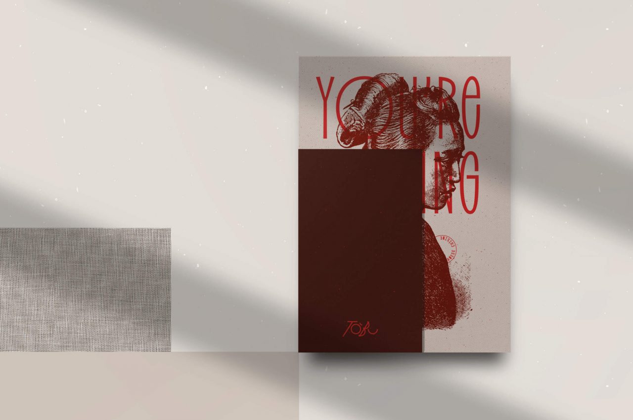
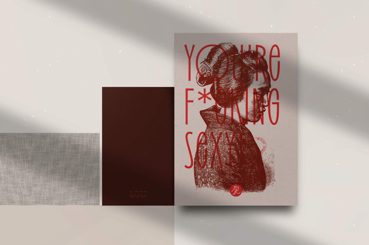
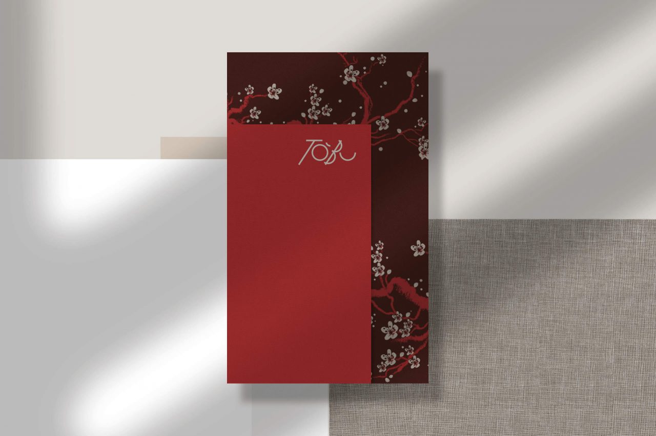
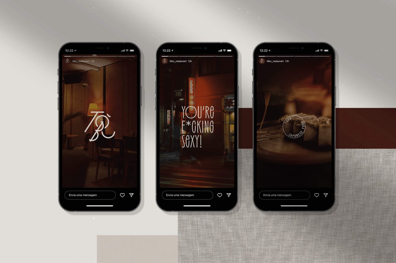
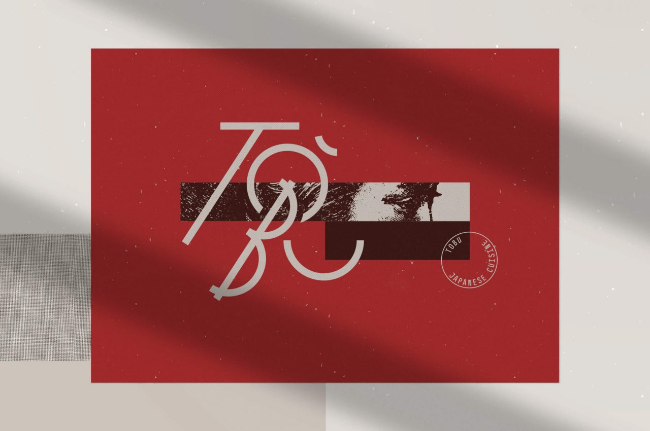
Inspired by oriental characters, we designed the typography for the logo, with a contemporary and geometric approach. Incorporating into the universe of the brand not only traditional elements, but also strong and provocative patterns and images.
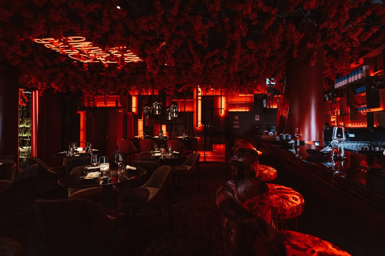
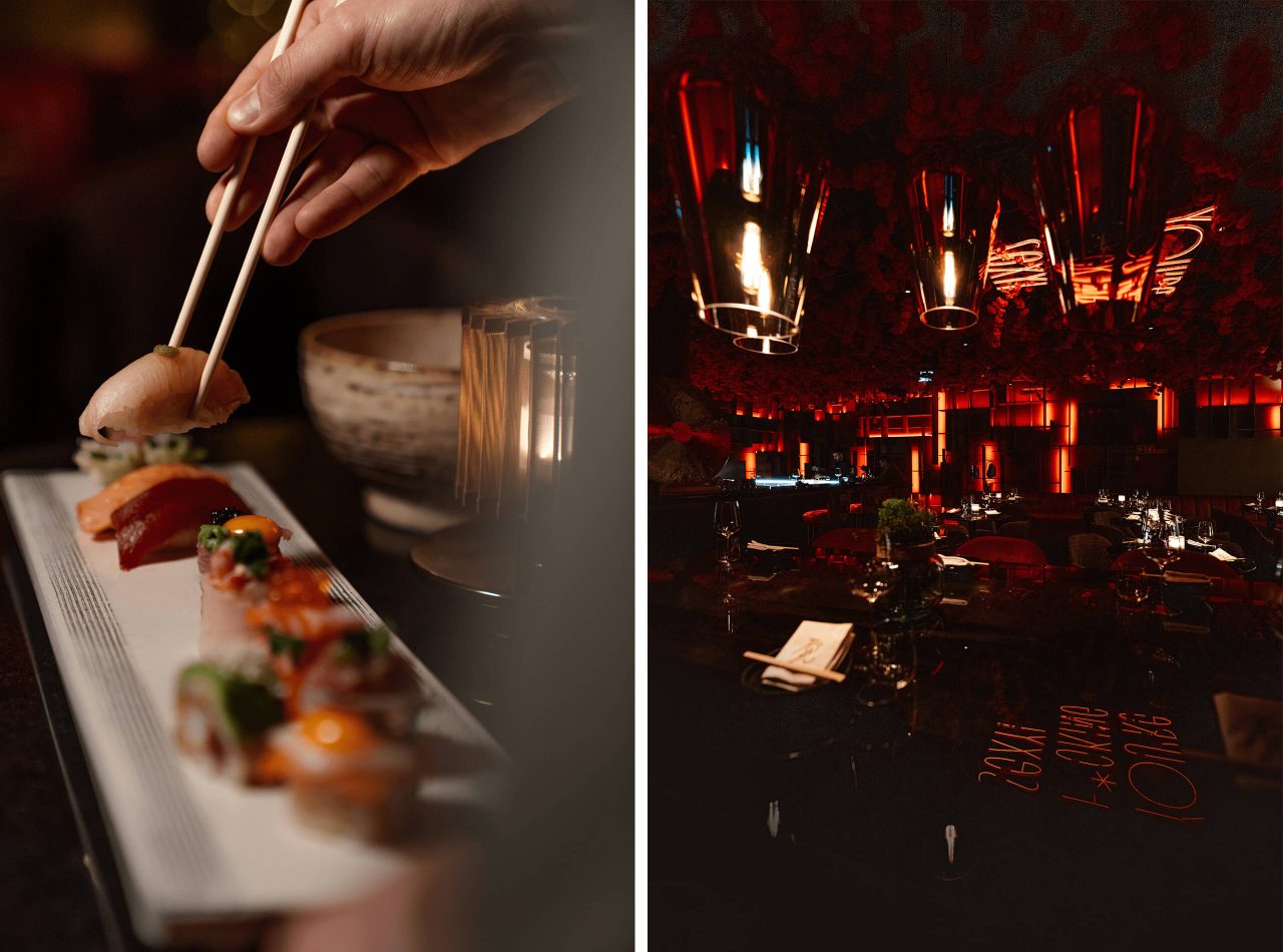
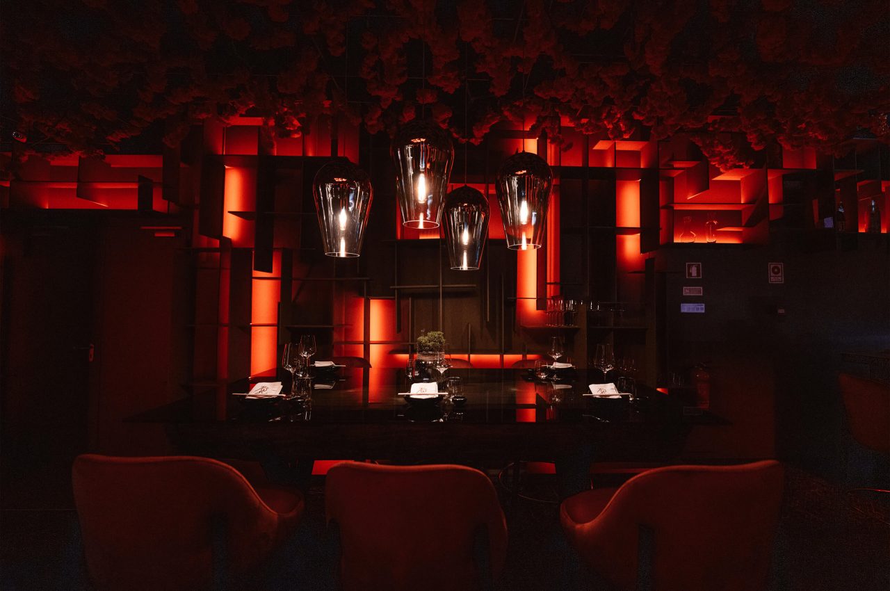
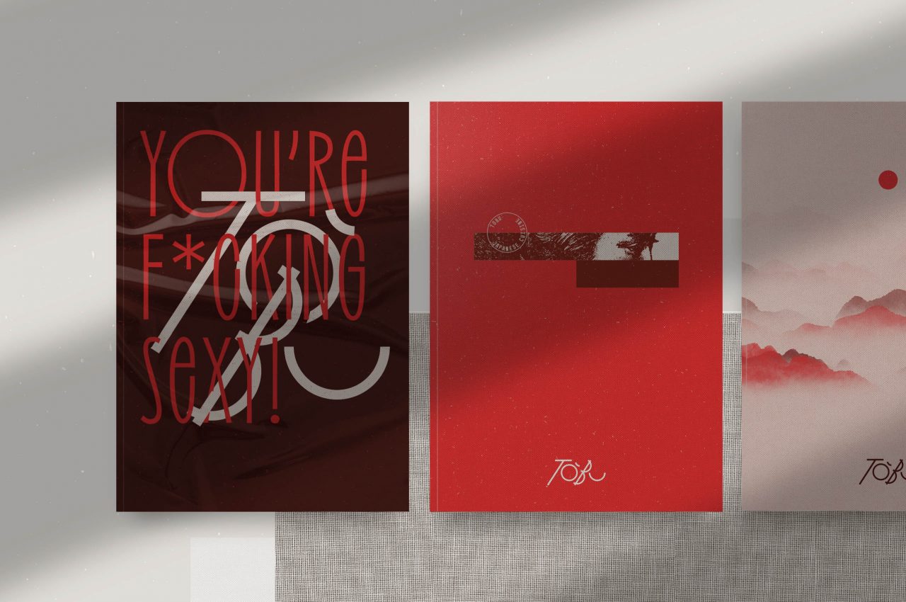
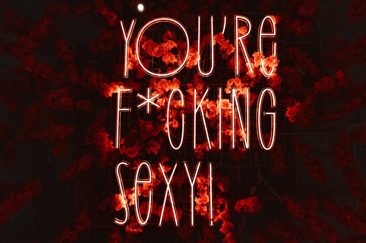
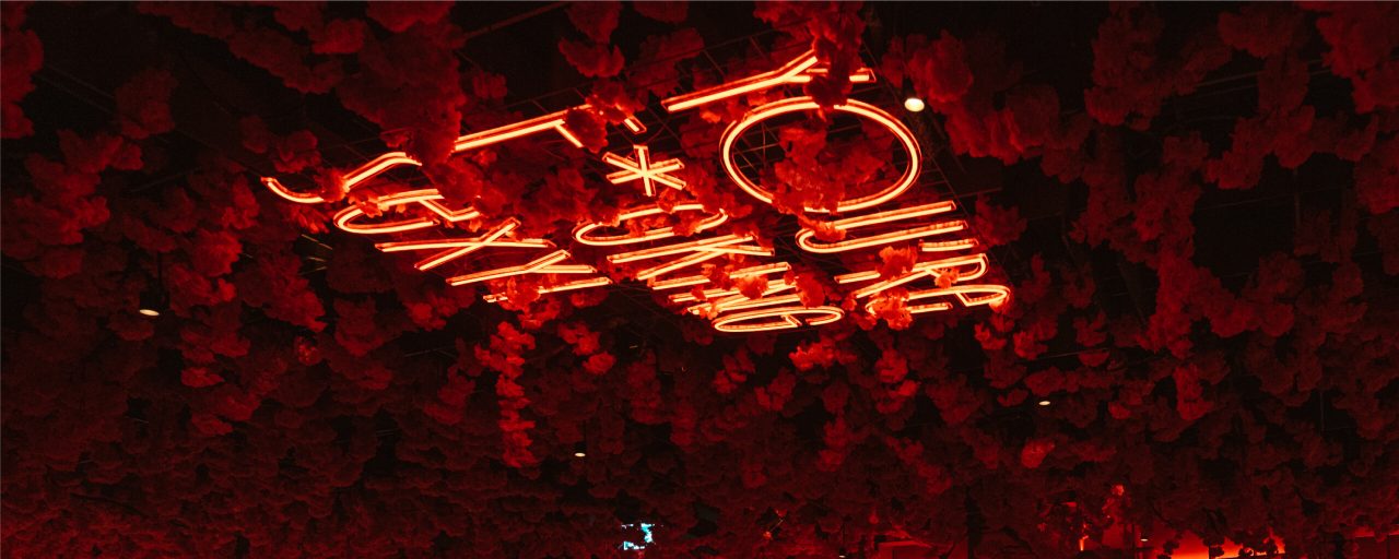
We used the color red, to create a strong and cohesive visual identity, following the concept of the space. Red is often associated with passion, energy and enthusiasm to provide a warm and welcoming experience.
RED IS BOLD! YOU’RE F*CKING SEXY!