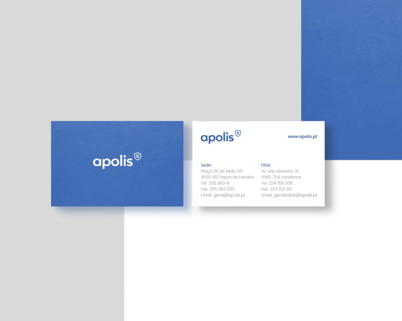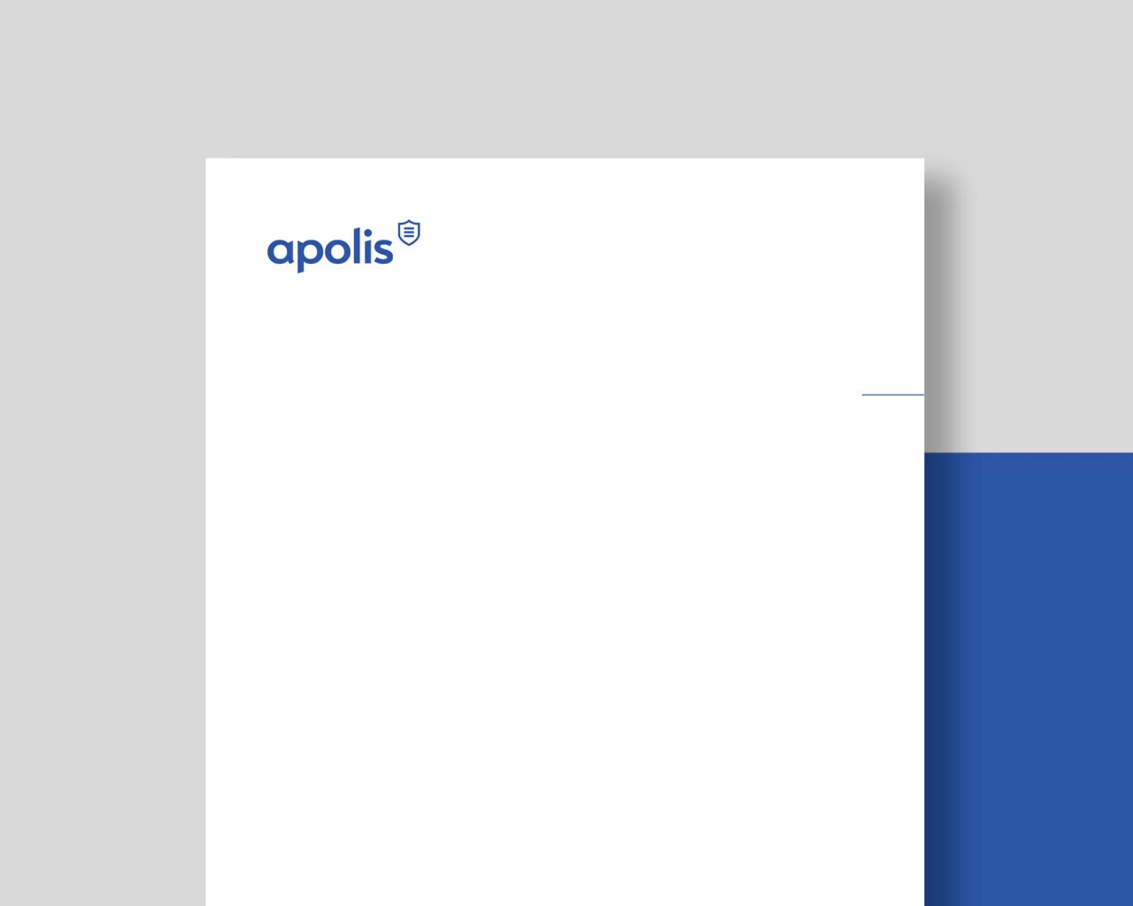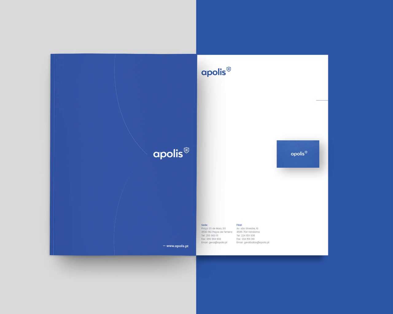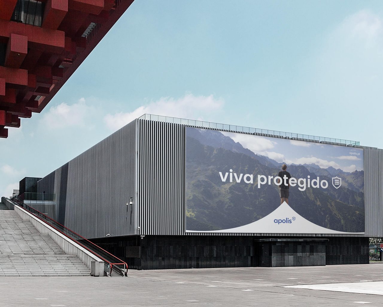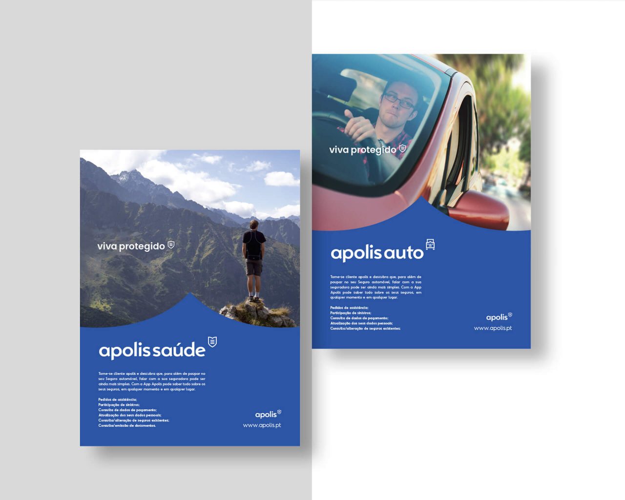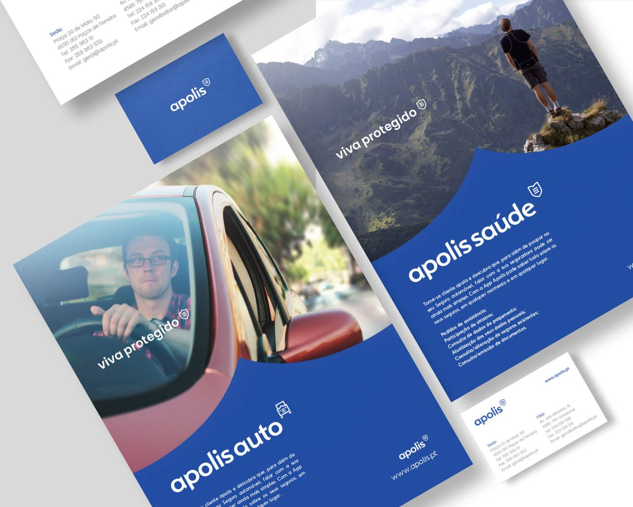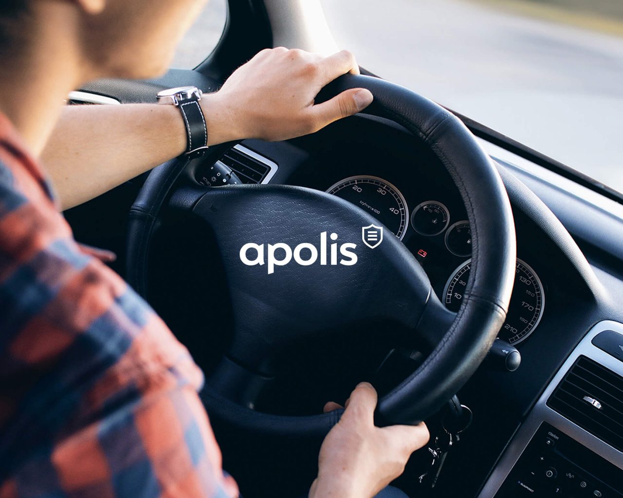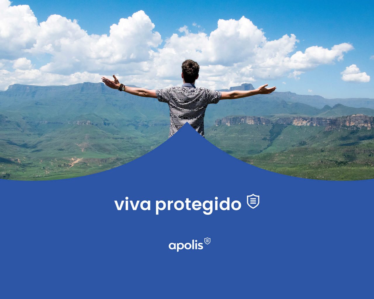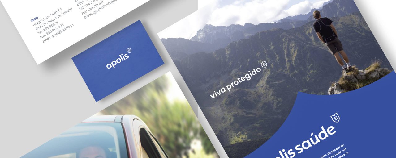
Visual identity project for Apolis, an insurance company, created based on security and the perception of being protected. The design of this identity had a goal into creating a branding that communicates the business sector of the brand to its clients. The union with the blue color, it relates to nobility. Conveys tranquility and serenity, which are the key points in an insurance contract.
Being an insurance company, it is vital that it is associated with an image that transmits confidence and tranquility to its customers. The color scheme used, is a result to communicate those same values. Just as in the logo itself, associated with the name, there was created a symbol in accordance with Apolis ideals. Sharings through this visual insurance identity, a sign of credibility to its clients.
Apolis project has won a bronze prize, for its corporate visual identity, at the International festival “Prémios Lusófonos da Criatividade“.
See more BULLSEYE winning projects.