“… We believe in healthy and energetic communities for everyday life.”
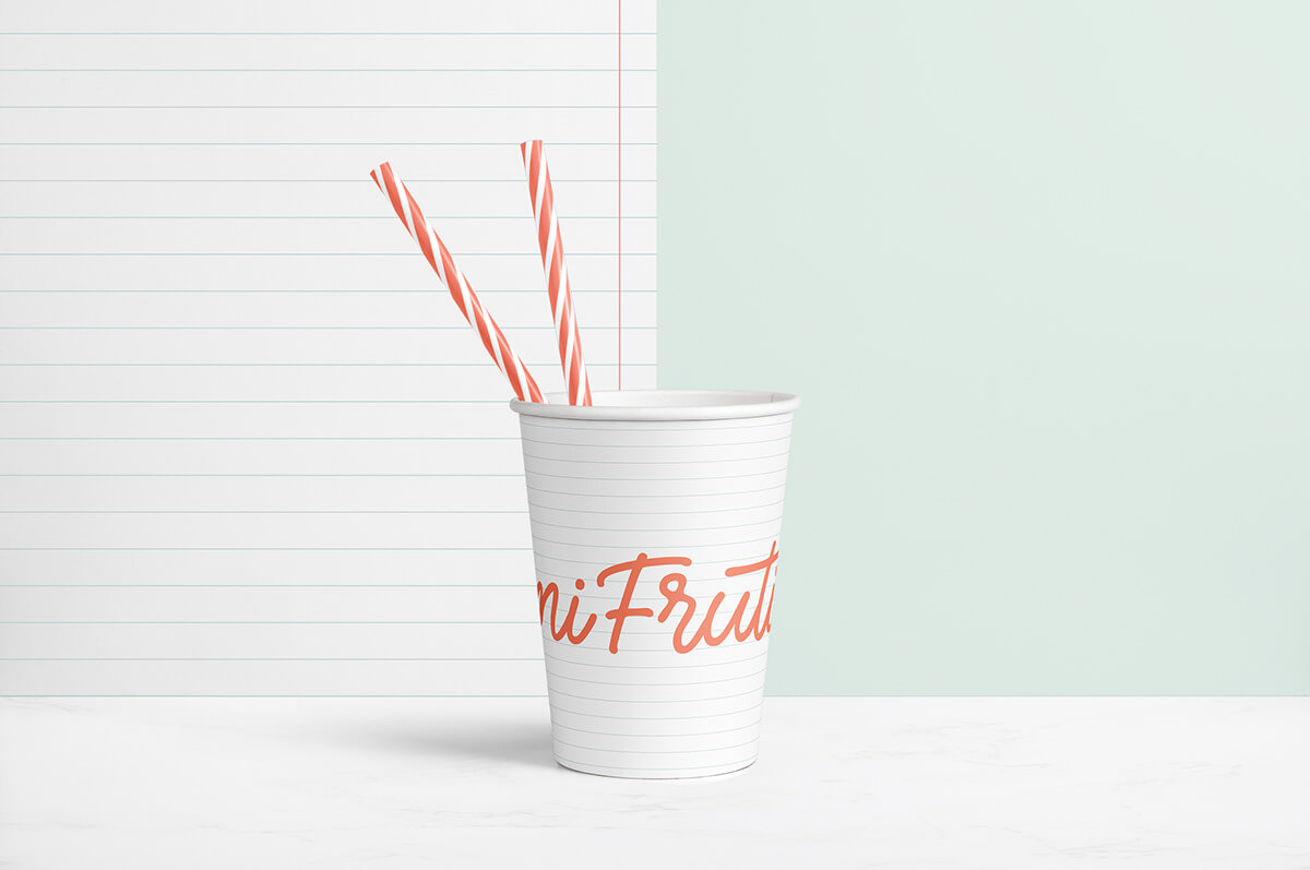
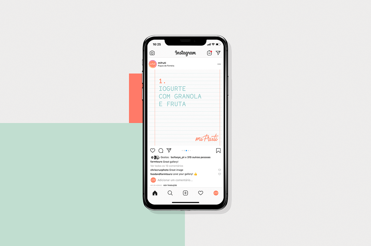
Mi Fruti one of the most welcoming spaces in the neighborhood, where we can go and organize our emails while enjoying a beautiful smoothie. A new concept of fruit growing closer to the community.
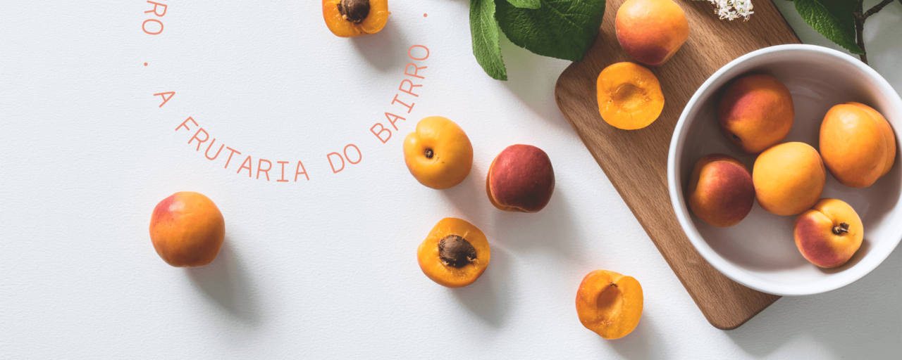
Here is where we will choose a healthy lifestyle, with the freshness of the best fruits and vegetables.
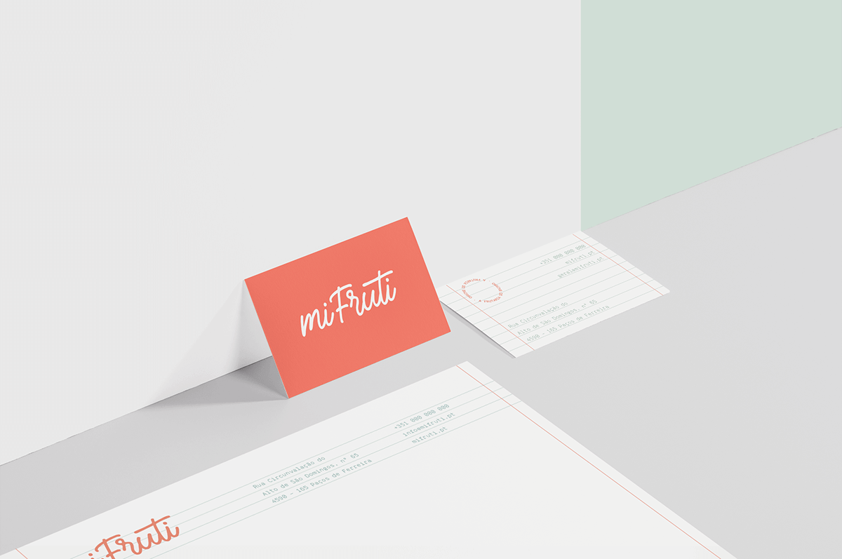
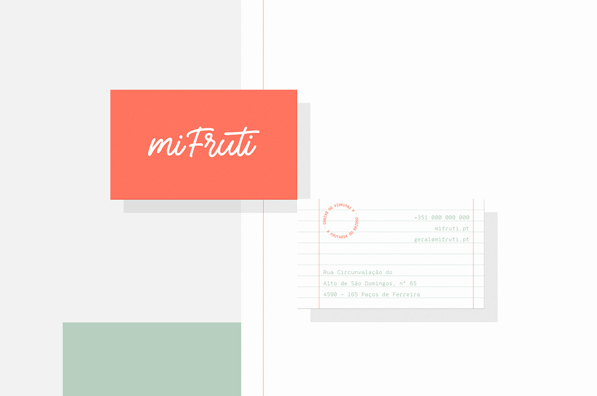
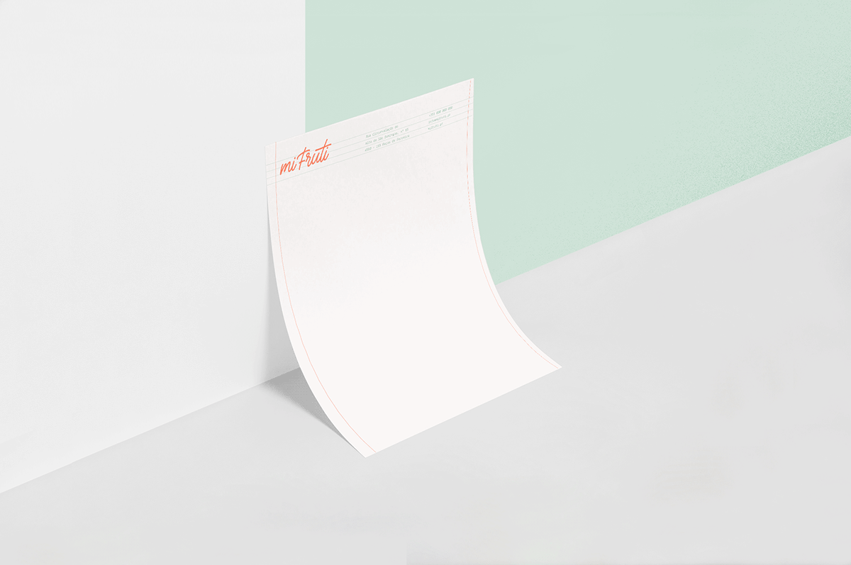
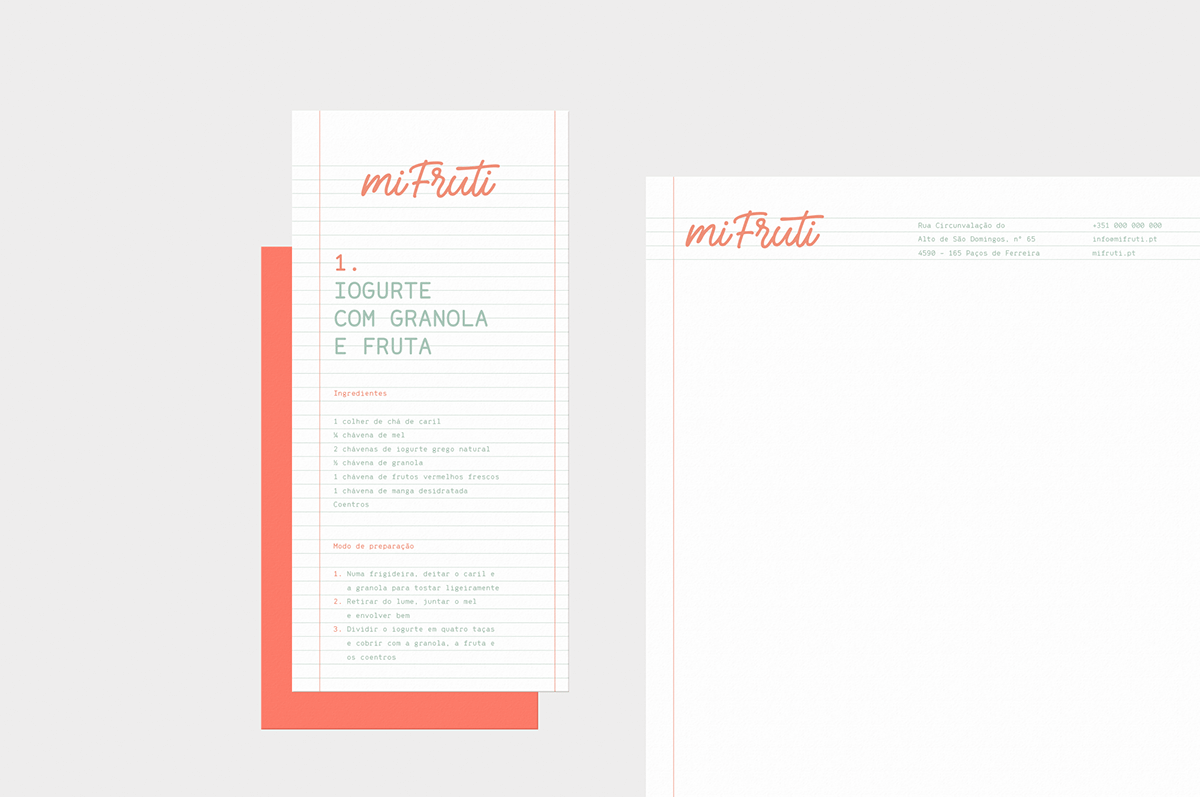
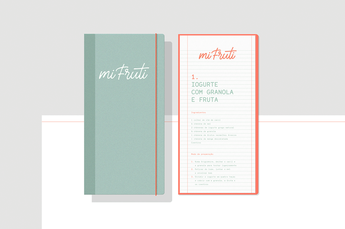
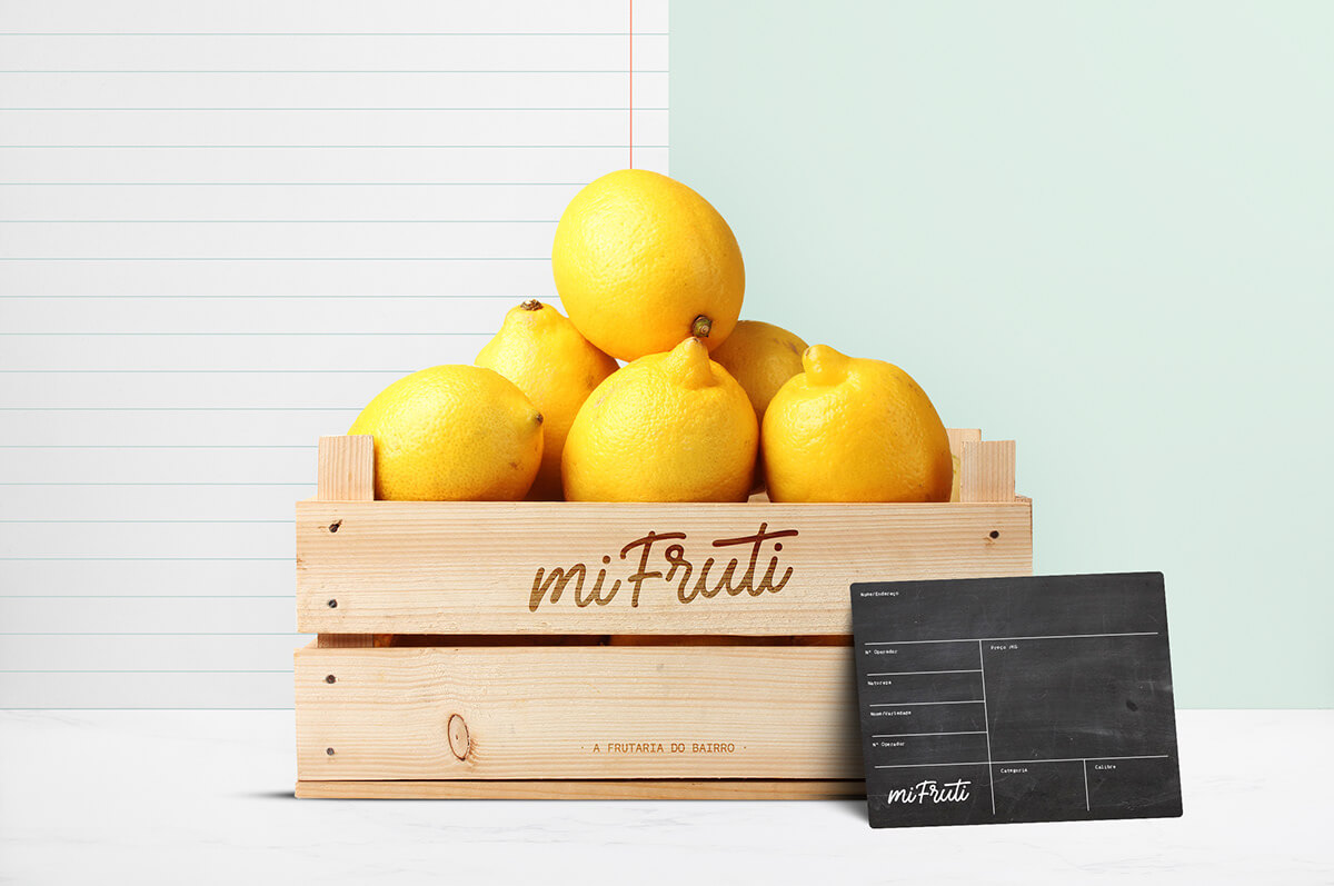
At the graphic level, our mission was to create a visual identity with the character of “new kid on the block”.
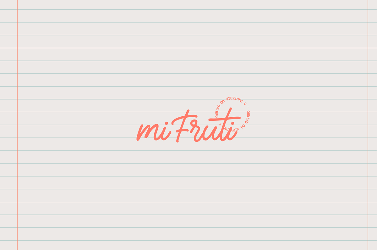
We went to look for typical elements in the old grocery stores where the consumption books of customers existed.
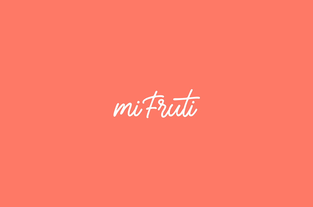
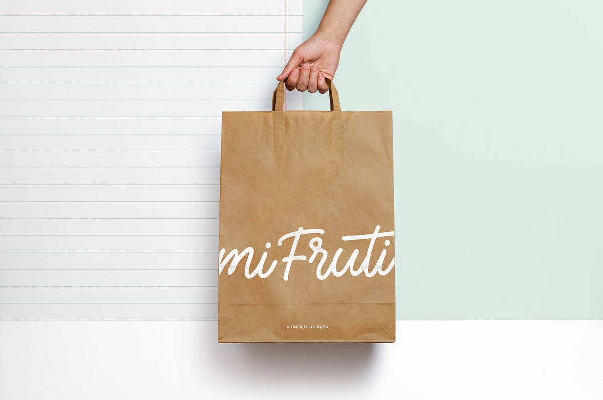
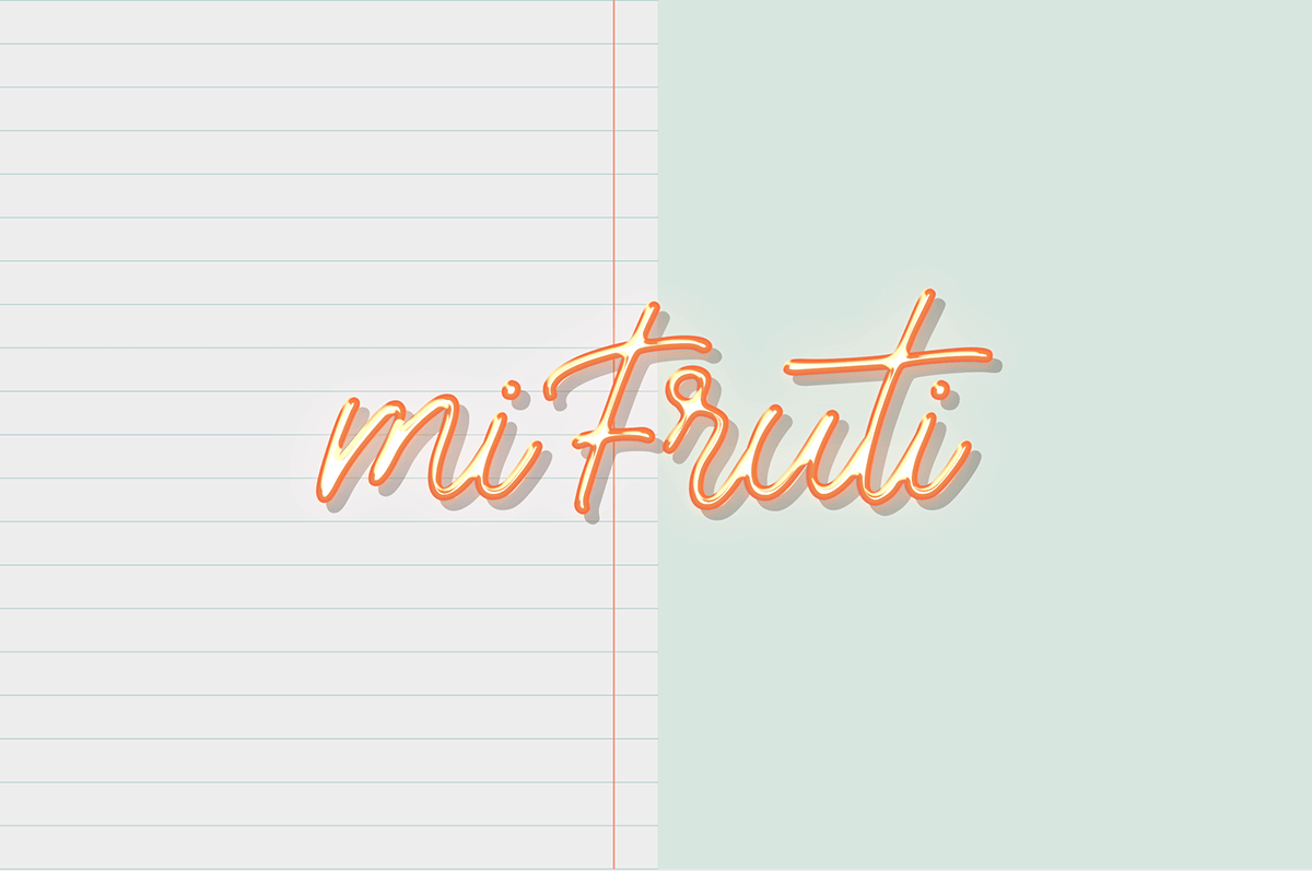
The deliberate choice of a handwritten font makes the logo more personal and closer. Pastel coral and mint colors create the perfect connection between the fresh and the welcoming.